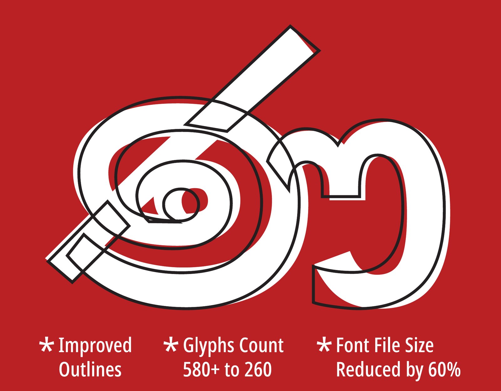
Noto Sans Sinhala v3, with the v2 outline traced over it
Overview
Noto Sans Sinhala ships with Android and renders most of the Sinhala text people read on screens worldwide. It is part of Noto, the open source type family Google maintains for the world’s writing systems. Over a decade of development the Sinhala font had grown inconsistent and bloated. In 2024, Google commissioned Mooniak to redesign it.
We improved the drawings and re-engineered how the font builds Sinhala text, while holding to the traditions of the script. Version 3.000 sets the same text from far fewer glyphs, and its file is about 60% smaller.
Client
Google
Studio
Mooniak, Colombo
Technical review
December 2018, Noto Sans Sinhala and Noto Serif Sinhala
Redesign commissioned
2024
Version
3.000 (from 2.006)
Scripts
Sinhala, with Latin from Noto Sans
Languages
Sinhala, and Pali and Sanskrit in Sinhala script
Axes
Weight 100–900 (Thin to Black), Width 62.5–100 (Extra Condensed to Normal)
Noto takes its name from “no more tofu”, the blank boxes a computer shows when it has no font for a character. Its purpose is to make sure every script displays, everywhere. Because it ships with Android, Noto Sans Sinhala is the voice of the Sinhala script on most phones: in notifications, messages, menus and the web.
That reach cuts both ways. A tight letter or a misplaced vowel sign is repeated on millions of screens, in text people read every day. And every extra kilobyte is downloaded and stored on every device that carries the font.
2018: a technical review
Our work on Noto began before the redesign. In December 2018, Pathum Egodawatta reviewed Noto Sans Sinhala and Noto Serif Sinhala for Google. He tested the fonts from the Noto repository in Chrome, set the full Sinhala character set with every combination needed for Pali and Sanskrit, and checked running text alongside real interface strings, such as Android’s USB debugging prompts.
The review found problems at every scale:
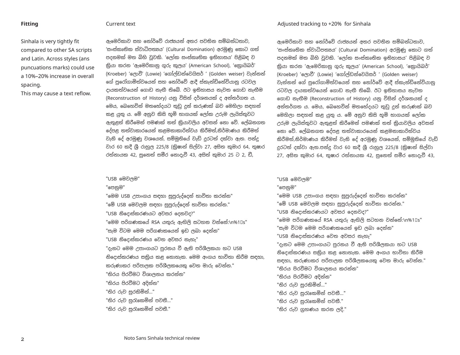
Fitting. Sinhala was set much tighter than Latin and the other South Asian scripts in Noto. The review recommended opening the spacing by 10–20%, accepting that text would reflow.
Spacing. The right side of ද, ඳ and ළ and the left side of the yansaya were too tight in every style, and quotation marks collided with some letters.
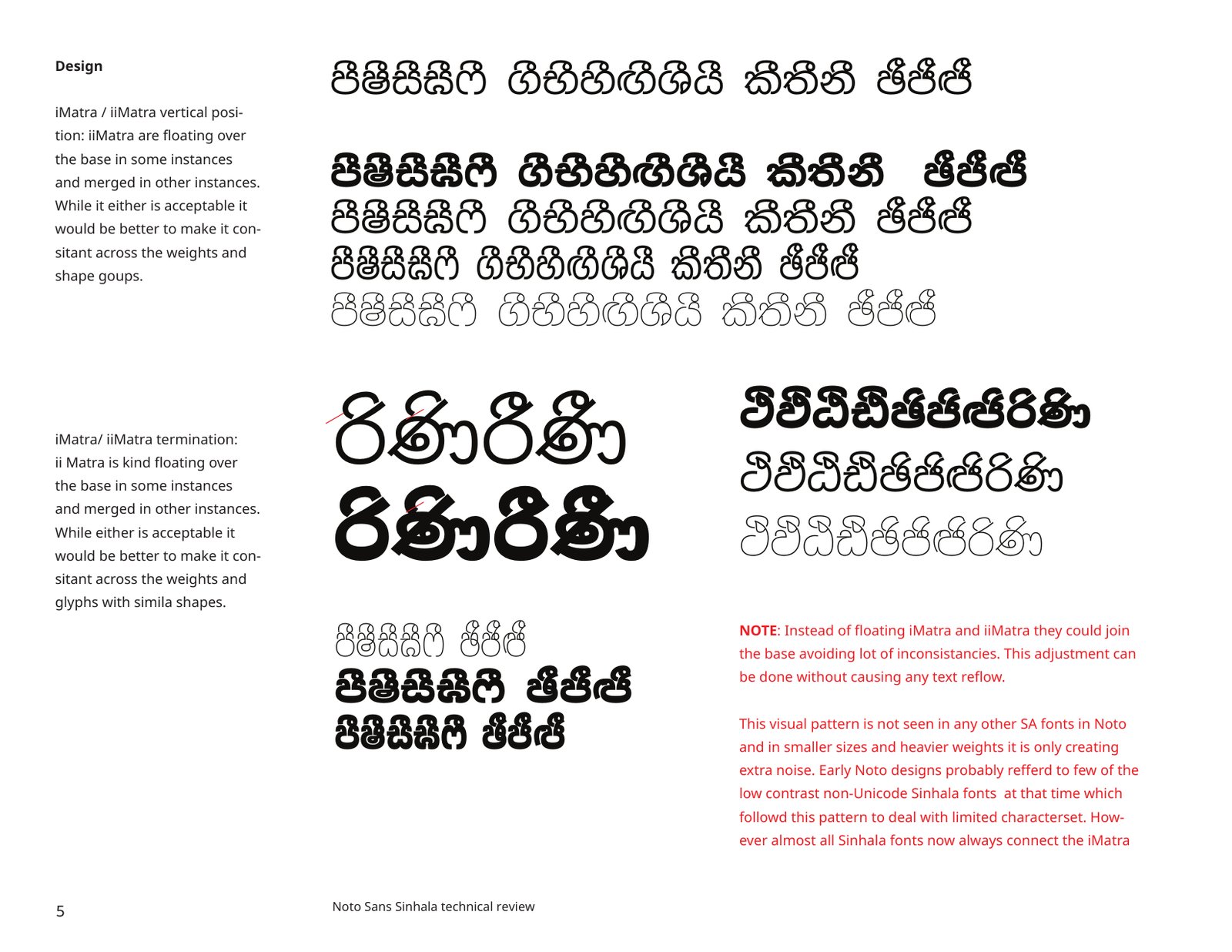
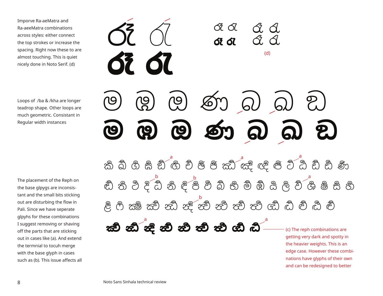
The ispilla. The vowel signs for i and ii floated above some letters and merged into others, with no consistent rule across weights.
Details. The tail of ශ curled in too far, the counter of the rakaransaya under ද was too small, the ae vowel signs sat low, and the repaya left small spurs that turned dark and spotty in the heavier weights.
Fitting: the original spacing (left) and the same text tracked out by 20% (right). From the 2018 review.
The floating ispilla was the most visible issue. The review traced it to early, low-contrast, pre-Unicode Sinhala fonts, which used the pattern to cope with a limited character set. No other South Asian font in Noto did this, and almost every Sinhala font today connects the ispilla to the letter. In small sizes and heavy weights the floating marks only added noise.
The ispilla floated over some letters and joined others. From the 2018 review.Repaya spurs and inconsistent loops, marked for correction. From the 2018 review.
When the redesign began, we revisited the fonts with what we had learned since, much of it from our work on Abhaya Libre. The notes covered:
Repaya and ispilla together. In rare cases the repaya and the keti or diga ispilla (U+0DD2, U+0DD3) fall on the same letter. The font has to handle these gracefully.
Repaya placement. Its position on touching conjuncts could follow the latest research and documentation, discussed in Abhaya Libre issues #64 and #65.
Conjuncts. We audited the touching conjuncts used in Pali and Sanskrit, such as ක්ෂ (k.ssa) and ග්ධ (g.dha), against earlier research.
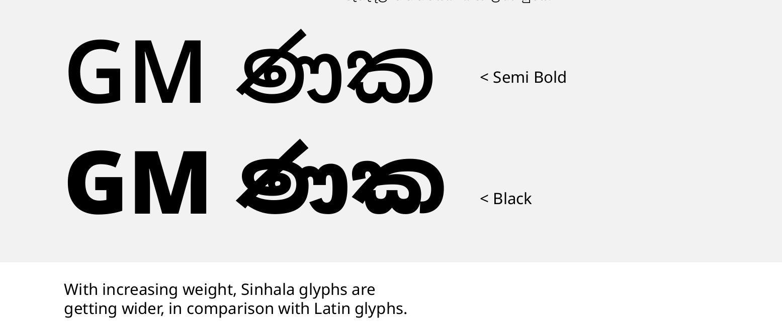
Weight and contrast. As the weight increased, Sinhala letters grew wider than the Latin beside them. The Sinhala also needed stronger stroke modulation than the Latin, to correct awkward angles and curves.
Letter width: the Sinhala widens faster than the Latin as weight increases. From the 2024 design remarks.
What changed
Each fix below is rendered live in both fonts, v2 on the left and v3 on the right. Type into either side to test your own text. Pick any weight and width, or choose All to see the change hold in every style from Thin to Black.
Connected ispilla
v3 joins the i and ii vowel signs to every letter, following how nearly all Sinhala fonts behave today. The 2018 review noted that this could be done without reflowing existing text.
v2 2.006 · 935 glyphsv3 3.000 · 595 glyphs
v2
v3
Weight
Width
Type into either side.
Spacing and fitting
Rather than loosen the whole script, v3 corrects the letters the review singled out. The right side of ද and ඳ, which ran into the next letter, now clears it, and ළ has more than twice the room on its right. Running text sets within a fraction of a percent of its v2 length, so interfaces built around the old font keep their layout.
v2 2.006 · 935 glyphsv3 3.000 · 595 glyphs
v2
v3
Weight
Width
Type into either side.
Repaya placement
v2 drew the repaya into a separate glyph for each letter it sat on. v3 draws it once, as a mark placed on the letter by OpenType rules, so it sits the same way everywhere.
v2 2.006 · 935 glyphsv3 3.000 · 595 glyphs
v2
v3
Weight
Width
Type into either side.
Touching conjuncts
The conjuncts used in Pali and Sanskrit text are all still there, redrawn to match the new letters.
v2 2.006 · 935 glyphsv3 3.000 · 595 glyphs
v2
v3
Weight
Width
Type into either side.
Fewer glyphs, smaller file
Most of the size saving came from how the font is built. v2 stored many letter and vowel-sign combinations as finished drawings: කී, ණු and ශ්රී were each a single glyph of their own. v3 composes them as the text is set, from the base letter and a vowel sign, choosing between a few variants of each sign so it fits the letter it joins.
The result is a font of 595 glyphs instead of 935, and a variable file of 492 KB instead of 1.16 MB. That is a saving on every device that ships the font and every web page that loads it. It also makes the font easier to keep consistent: a vowel sign corrected once is corrected on every letter it joins.
ණුණු
v3, filled
v2, outline
Improved outlines
Glyph count 935 to 595
Font file size reduced by 58%
Weight
Width
Weight and width
One variable file covers every weight from Thin to Black and every width from Extra Condensed to Normal. v3 keeps the same axes and ranges as v2, so it works as a drop-in replacement.
Below, every named style of both versions sits side by side: nine weights at each of four widths. Switch between them, or show them all at once.
v2 2.006 · 935 glyphsv3 3.000 · 595 glyphs
Thin
v2ශ්රී ලංකාව
v3ශ්රී ලංකාව
ExtraLight
v2ශ්රී ලංකාව
v3ශ්රී ලංකාව
Light
v2ශ්රී ලංකාව
v3ශ්රී ලංකාව
Regular
v2ශ්රී ලංකාව
v3ශ්රී ලංකාව
Medium
v2ශ්රී ලංකාව
v3ශ්රී ලංකාව
SemiBold
v2ශ්රී ලංකාව
v3ශ්රී ලංකාව
Bold
v2ශ්රී ලංකාව
v3ශ්රී ලංකාව
ExtraBold
v2ශ්රී ලංකාව
v3ශ්රී ලංකාව
Black
v2ශ්රී ලංකාව
v3ශ්රී ලංකාව
Weight
Width
Between the named styles, the axes are continuous. Use the sliders to set any weight and width in between.
v2 2.006 · 935 glyphsv3 3.000 · 595 glyphs
v2
v3
Weight
Width
Both versions respond together.
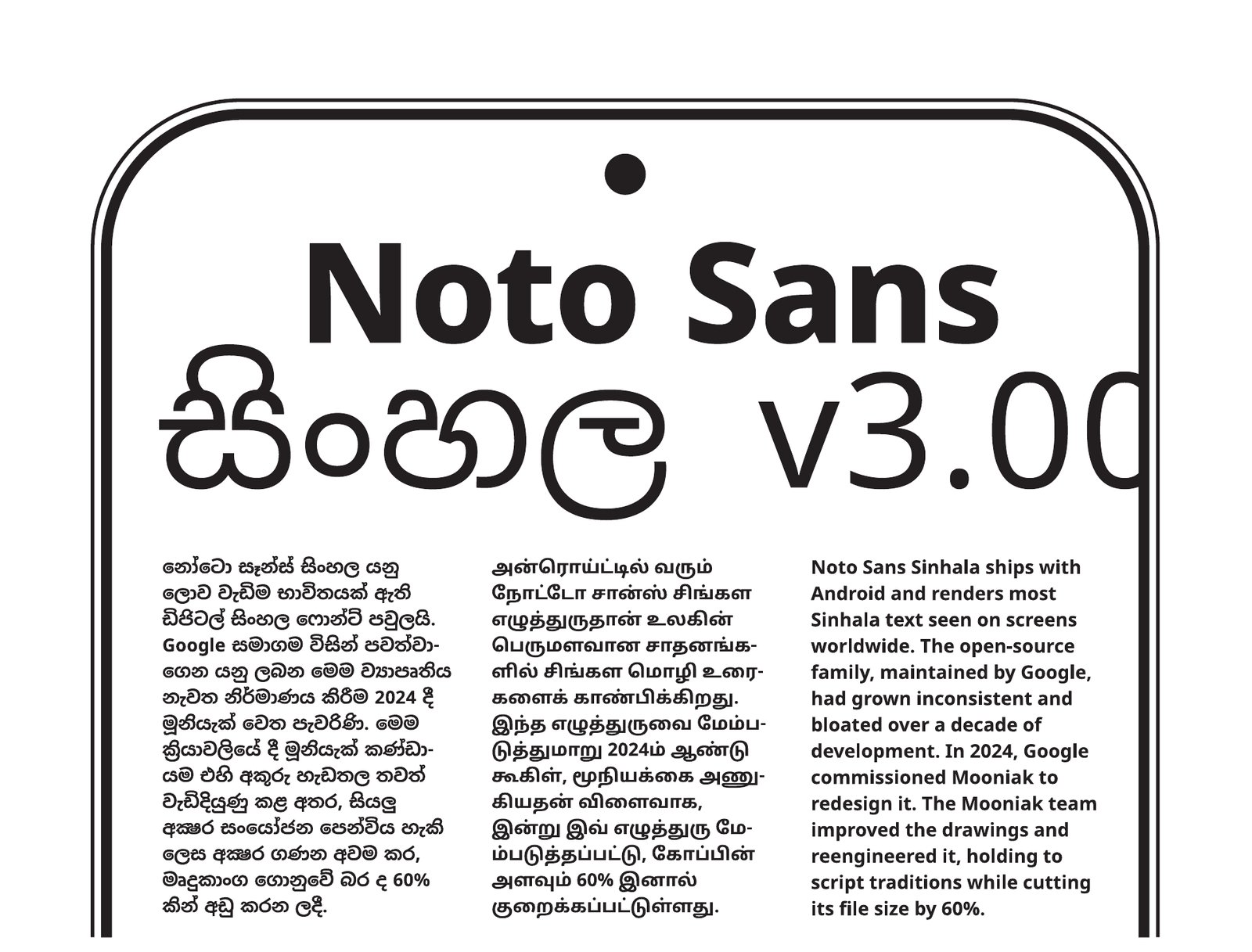
Launch specimen
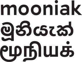
We introduced v3 with a specimen in Sinhala, Tamil and English, set as a phone screen to show where most people will meet the font. The interactive specimens on this page are live versions of it.