The Sinhala letters we read in print today were not shaped mainly by Sinhala scribes or by the long tradition of writing on palm leaf. They were shaped by a few printing offices, most of them run by missionaries, between the 1730s and the 1860s. The people running them had printing presses, evangelical ambitions and limited knowledge of the script they were casting in metal. A handful of decisions they made, in the 1810s and again in the 1860s, still govern how Sinhala type looks.
This article follows three of those printing and type-making operations in turn:
- the Dutch Government Press in Colombo, which made the first Sinhala movable type in the 1730s;
- the Serampore Mission Press in Bengal, which cut the first Sinhala type with stroke contrast between 1811 and 1816;
- the Wesleyan Mission Press in Colombo, which ran from 1814 to 1878 and turned those experiments into the standard every later printer inherited.
It is adapted from Casting Sinhala: Printed Letter in Colonial Ceylon, my dissertation for the MA in Typeface Design at the University of Reading, which draws heavily on Tilak Kularatne's History of Printing and Publishing in Ceylon. The country is called Ceylon here, the name it had during the period.
A script made for the stylus
Sinhala developed in three broad stages: linear, semi-linear and circular. The early Brahmi forms on stone inscriptions are made of horizontal and vertical lines. The inscriptions on the Sigiriya mirror wall, written between the 8th and 10th centuries, show a semi-linear stage. With the Buddhist palm-leaf manuscript tradition, the letters became round.
Palm leaf was written with a metal or wooden stylus that scratched the surface; a straight line along the grain would split the leaf. The resulting letters were round and monolinear, with no difference between thick and thin strokes. Manuscripts were written as an unbroken stream of characters with no spaces between words, and used their own punctuation, chief among them the kundaliya (෴).
Reading and writing were taught at temples and practised mostly by monks and a few educated laymen. When the first printers arrived, palm-leaf manuscripts were the only model of written Sinhala they had.
The Dutch Press, 1736–1796: Sinhala in movable type
Sinhala was first printed in movable type at the Dutch Press in Colombo in 1737. (The first Sinhala printing of any kind is in Joannes Ruell's Grammatica Cingalica, printed in Amsterdam in 1703.) The Dutch East India Company and the Dutch Reformed Church set the press up to print government notices, called plakkaten, and a Sinhala Bible. Between 1736 and 1791 it printed sixty-three books in Sinhala, Tamil, Portuguese and Dutch.
The type was made locally. Gabriel Schade, the baas (superintendent) of the Dutch armoury, took on the job of setting up a press and making Sinhala type in 1725. He was a metalworker who maintained the armoury's guns, and he almost certainly had help from Sinhala scribes and local silversmiths. By 1729 he had cut two founts (a fount is a complete set of metal type in one size and style). A change of governor delayed the work, and the printing office was running by 1736 with a press sent from Java. After Schade died in 1737 a Dutch soldier was trained to carry on casting type, and the foundry eventually produced three Sinhala founts.
A hybrid page
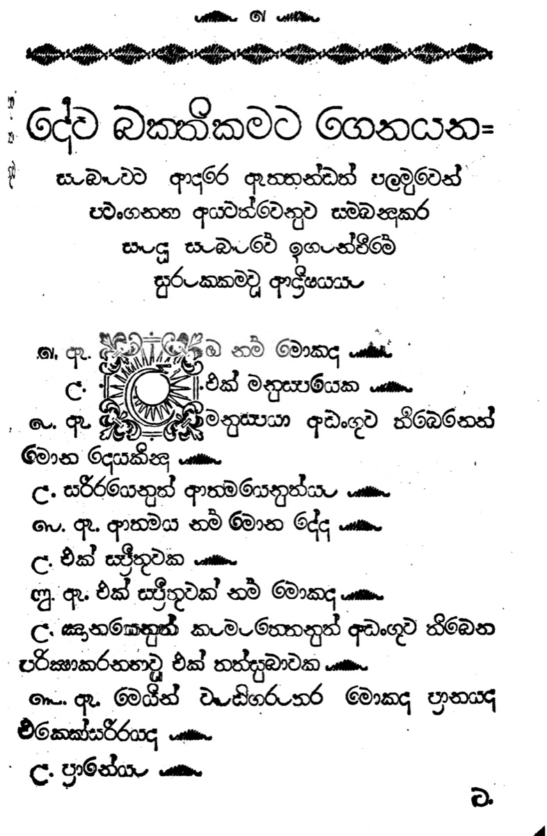
The Dutch Press page is a hybrid of Western typographic conventions and the habits of the palm leaf. Printing forced changes to how Sinhala was written:
- Word spaces. The early plakkaten run words together as manuscripts did. Later books introduce spaces between words, though inconsistently, since there was no standard for dividing words yet.
- Hyphens and colons. Words broken at the end of a line were marked with a short double horizontal line. The colon also entered Sinhala here.
- Punctuation dropped. Two manuscript marks were discarded: the kakapada (crow's foot), which ended a phrase, and the peiyala, which marked a repeated passage, a space-saver suited to Buddhist chanting.
- Punctuation kept. The kundaliya stayed, and the Dutch compositors used it heavily: once for a pause, doubled or tripled to end a section, and as an ornament filling margins and framing decorated initials.
Pages, chapters and dates were numbered in Sinhala Ilakkam, the old Sinhala numerals. Books usually opened with a Dutch title page followed by a Sinhala one set in a matching layout.
Letters that remember the palm leaf
The Dutch founts are monolinear, with long exit strokes and round shapes taken directly from manuscript letters. Schade probably modelled them on fast, everyday manuscript writing: the type includes ligatures common in quick handwriting, such as a single sort for ඇ (æ), and joined forms of the ælapilla (ා) for the letters whose strokes end on the baseline, ක, න, ත, ණ, ග and හ. The straight vertical end of ද (da) is found in no other Sinhala type.
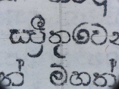
The character set was small. Each of Schade's two founts had only fourteen sorts (individual pieces of type), according to the historian Jurriaanse, because the vowel signs (pili) were cast as separate pieces and combined with base consonants. A syllable such as ක්රී (krī) or ක්රෝ (krō) could take two to four separate pieces of metal to set. This compound-sorts system, building syllables out of modular parts, would remain the model for Sinhala composition for the next eighty years.
Serampore, 1811–1816: the first Sinhala type with contrast
In the early 19th century the Serampore Mission Press in Bengal, run by William Carey, Joshua Marshman and William Ward, was the leading missionary press in the region, printing scriptures in more than forty languages. Its type foundry employed local punchcutters. Panchanan Karmakar and then his son-in-law Manohar Karmakar, who took over in 1803, cut type for at least fifteen languages, often working from samples written by calligraphers of each script.
After the British took Ceylon, the Calcutta Auxiliary Bible Society agreed in 1811 to print 5,000 copies of the New Testament in Sinhala at Serampore. Rev. T. J. Twisleton in Colombo sent copies of the Dutch Press scriptures and a specimen of letters for an improved type, probably written by a Sinhala scribe in government service. A Sinhala fount was being cut by August 1811, most likely under Manohar Karmakar. In 1812 Gregory de Silva, an experienced printer from the Dutch Government Press, travelled to Serampore with a Sinhala corrector to help.
The New Testament went to press on 31 December 1812 and reached Colombo in batches in 1813 and 1814. It ran to 1,183 octavo pages, too big and too expensive to distribute widely. The Colombo committee decided to print in Colombo instead, and in 1813 the punches, matrices and moulds for this large fount (call it SP01) were sent to Ceylon.
A smaller fount was needed. Serampore was already trying to shrink all its non-Latin types, because the "largeness of the oriental types" made printing expensive, and Sinhala was among the costliest scripts to print. In July 1816 the Colombo Auxiliary Bible Society ordered a smaller Sinhala fount (SP02), enclosing "patterns": letters written by Don Abraham, a Sinhala Christian, and Petrus Panditta Sekara, a former Buddhist monk, both among the most learned men involved in the Bible translation. The work at Serampore was probably led by John Lawson, a skilled punchcutter who joined in 1812 and was reducing the size of its types while improving their design.
Reading the pen in metal
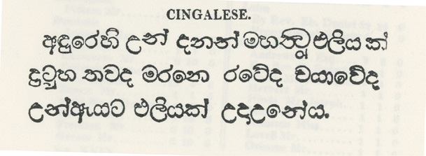
The two Serampore founts are a turning point. They are the first Sinhala types with stroke modulation, thick and thin parts in a stroke.
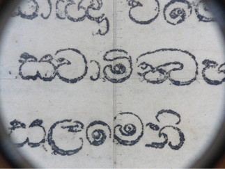
The models sent from Ceylon were written on paper, not palm leaf. Paper had been in Ceylon since the Portuguese, and by the 19th century pen and paper were in daily use in government work; the samples were most likely written with a pointed nib. The Serampore punchcutters reproduced the modulation of the pen. Other features also come from handwriting rather than the stylus:
- The tops of ම (ma), ඔ (o) and ව (va) turn inward towards the body, so the letters look compact and contained, unlike the open round strokes of the Dutch type.
- න (na), ත (ta), ක (ka) and ද (da) gain a small circular "eye" with a counter inside it, a trace of written loops.
- Letters with tall vowel signs, such as ඛි, බි, මි, ධි and වි, are squashed vertically to fit the height of the type body.
The way the type was assembled had not caught up with the new letters. Serampore kept the Dutch compound-sorts system, so the vowel signs were still separate pieces, and they sit at uneven distances and offsets from their consonants. The repaya (ර්) is detached. The single letters are fluent, but the syllables built from them are not.
The large fount was used for The Cinghalese Translation of the New Testament (1814). Although two compositors from the Dutch Press worked on it, its typography breaks completely with the Dutch style: no kundaliya, and the first parentheses in a Sinhala Bible. Sinhala numerals stayed.
The Wesleyan Mission Press: setting the standard
The largest and most influential printer in 19th-century Ceylon was the Wesleyan Mission Press in Colombo. A party of Wesleyan missionaries left Britain in 1813, and two of them, William Martin Harvard and Thomas Squance, knew printing. Harvard had worked in printing and type making at Fry and Co. in London, and he brought a press, ink, type and paper with him in 1814.
The Wesleyan printers were soon doing better work than anyone else on the island. By 1817 the press had thirty-one staff, including four Sinhala compositors and two letter founders; by 1862 it had printed around 1.5 million publications in Sinhala, English, Tamil, Portuguese and Burmese. Its output ranged from Bibles to grammar books, Clough's dictionaries (English–Sinhalese, 1821; Sinhalese–English, 1830), periodicals, school books, tracts and handbills. A large part of the ephemera attacked Buddhism and local religious practice. That campaign provoked the Buddhist revival of the 1860s, which set up its own presses and answered the missionaries in print.
Repairing the Serampore type
The smaller Serampore fount arrived in Colombo broken and incomplete. Rather than wait for replacements, Harvard set up a type foundry at the Mission in 1816, hired a punchcutter and a mould maker (very likely local silversmiths, whose names are not recorded) and cast the missing characters himself. From then on, every Sinhala type used at the Wesleyan Press was cut and cast in-house. By 1864 the foundry had produced five Sinhala founts.
The Serampore type still had two problems: there were not enough sorts of some characters, and the small separate vowel signs bent and broke under the press and failed to print. In 1819 John Callaway counted "the average number of times each character occurs in a sheet of demy", in effect a frequency analysis of Sinhala text, and used it to design a new type case a third the size of the old one.
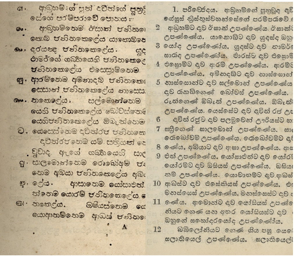
In 1818 the press tried casting a new fount on a small pica body with the vowel signs attached to the consonants, rather than as separate pieces. It was in use by the early 1820s. This is the start of the way modern Sinhala type is composed: syllables as whole units, not assembled from fragments. The letters kept the Serampore stroke structure, but the joined vowel signs gave the type a steadier rhythm and a more even texture on the page.
Breaking with the palm leaf
The Wesleyans dropped what was left of the manuscript tradition in the Dutch page. Decorated initials disappeared. The kundaliya was not used in their early books at all, though their own foundry could easily have cut one. It became a mark reserved for Pali, Buddhist and classical Sinhala texts, and by the end of the century it had gone from everyday Sinhala writing. The Dutch double-line hyphen went too; words were simply broken to fill a justified line.
Bilingual printing became a speciality. Alexander Moon's Catalogue of the Indigenous and Exotic Plants Growing in Ceylon (1824) sets Sinhala and English in parallel with a Latin transliteration, using Sinhala numerals for Sinhala entries and Arabic numerals for the rest. In the same year, The Christian Institutes, set in the new 1820s fount, uses no Sinhala numerals at all, probably because none had been cut for it. Over the following decades Arabic numerals replaced Sinhala ones in print.
Nicholson's founts, 1864–1865: contrast comes to Sinhala
The second burst of activity at the foundry came in the 1860s. James Nicholson, a trained printer, arrived in 1861 to supervise the press. He wanted economical pocket Bibles and books in an "attractive form", and drew up plans for two new founts:
- WP02, "a Sinhalese fount of Great Primer", bolder than any Sinhala type before it, for handbills, lesson books and Scripture cards that needed to be "prominent" and "readable";
- WP03, a fount of Brevier (about 8 points), smaller than any earlier Sinhala type, for the pocket editions.
Both were in use by 1865. WP02 is a landmark: it is the first Sinhala type with high contrast, heavy thick strokes against fine thin ones. Its modulation follows none of the earlier Sinhala types. It corresponds instead to the high-contrast Modern faces then fashionable for Latin type in Britain, which Nicholson knew far better than Sinhala, a script he had been reading for only a few years. WP03 carries the same structure at lower contrast, but prints darker than any earlier Sinhala type, probably because of the limits of cutting punches so small.
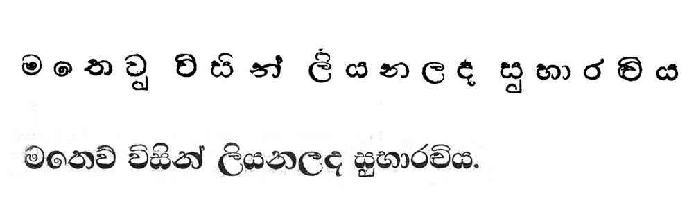
Sella Lihini Sandese (1865), one of the finest books from the press, uses all five of the Wesleyan Sinhala founts.
Why the Wesleyan style won
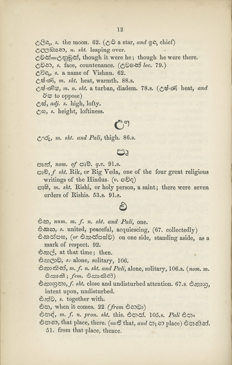
From the 1860s printing in Ceylon grew fast. Commercial printers appeared, the Buddhist revival opened its own presses, and by 1870 there were "several type casters" in Colombo; the best-known private foundry, Cooray and Company, opened in 1892. All of them followed the Wesleyan model, for three reasons:
- The Wesleyan Press had the best reputation for quality, and other printers copied it. In 1878 it received an Honourable Mention at the Paris Universal Exposition.
- No one else printed Sinhala, or Sinhala with English, at anything like its scale.
- Compositors and printers trained at the press left for other presses from the 1830s onwards and took its practices with them.
The high-contrast model introduced in the 1860s became the norm for Sinhala type, and the native foundries of the late 19th century carried it on.
What this means for Sinhala type now
Three things set in this period are still with us:
- Contrast. Sinhala has no tradition of thick and thin strokes of its own. Modulation arrived with pen-written models at Serampore, and high contrast arrived with Nicholson's founts in the 1860s, modelled on Latin type.
- Composition. The move from vowel signs as separate sorts to syllables cast as whole units, begun in 1818, is the ancestor of how Sinhala fonts compose syllables today.
- The page. Word spaces, Western punctuation, Arabic numerals and the retirement of the kundaliya all come from adapting Sinhala to the metal type and the kinds of document missionaries wanted to print.
The technical framework of printing with metal type had been built for Latin, and adapting Sinhala to it meant constraints and compromises. The missionaries' attitude to local religion and culture also shaped what they kept and what they discarded. This was not a single act of cultural imposition, but part of the wider social and economic change under British rule and the evangelical missions. Knowing where these forms came from, and why these decisions were made, gives us better criteria for judging Sinhala typefaces and designing new ones. It is also why, in 2017, we went back to the Dutch Press prints with Janaka Attanayake and drew a typeface from them.
Further reading
- Tilak Kularatne, History of Printing and Publishing in Ceylon (2006).
- M. W. Jurriaanse, "Gabriel Schade and his invention of the Sinhalese type", Journal of the Dutch Burgher Union, XXXII (4), 1943.
- W. M. Harvard, A Narrative of the Establishment and Progress of the Missions to Ceylon and India.
- R. S. Hardy, Jubilee Memorials of the Wesleyan Mission, South Ceylon, 1814–1864 (1864).
- Fiona Ross, The Printed Bengali Character and its Evolution (1999).
- Rafael Saraiva, "An Overview of Sinhala Type Design from the 18th Century to the Present Day" (2012).
- Sinhala vowel signs: how pili modify a consonant, for how today's fonts handle the vowel signs that gave early printers so much trouble.