Overview
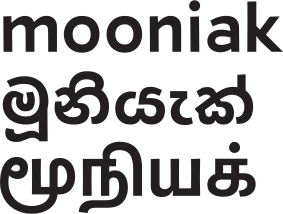
Stick No Bills is a Latin, Sinhala and Tamil stencil typeface that Stick No Bills and Mooniak made available for free download worldwide. It was first launched as the bespoke libre typeface of Stick No Bills™, the poster gallery and co-located design studio at the heart of Galle Fort that “is rapidly attaining iconic status” (Life Times Magazine, October 2015). It was Mooniak's first complete font release.
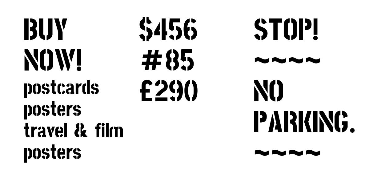
The family has six weights, from Extra Light to Extra Bold, for multiple purposes. Its stencil structure is lightly based on the stencil letters found on street signs around the world. The result is a novel, retro, readable, multilingual and freely available typeface.
| Client | Stick No Bills Poster Gallery, Galle |
| Studio | Mooniak, Colombo |
| Started | February 2015 |
| First release | v001, 20 March 2015 |
| Latest release | v1.220, February 2017 |
| Released on Google Fonts | October 2021 |
| Scripts | Sinhala, Tamil, Latin |
| Weights | Six, from Extra Light to Extra Bold |
| Licence | SIL Open Font License 1.1 |
| Source | github.com/mooniak/stick-no-bills-font |
| Specimen | Google Fonts |
Origins
Stick No Bills™ co-founders and directors Meg and Philip James Baber created the first drawings of the Latin uppercase letters in collaboration with British veteran designer Martyn Hodges in 2012. Hodges, who produced fonts for major American brands across the United States during the 1980s, made the first version of the old school style uppercase on paper. The Babers' ultimate requirement was to pioneer a tailor-made Stick No Bills™ font to serve as high impact branding collateral, with which they could best promote their gallery business to the world.
To that end, Mooniak, a collective of designers that practises free and libre typography and design, was commissioned to develop the project further. Following a proposal by Mooniak to expand the family, Stick No Bills released the font under the Open Font License, an open source license. Google Fonts provided further financial support for a comprehensive Latin, Tamil and Sinhala script family over the course of 2015.
The brief
The gallery already had drawings for the Latin capitals by Martyn Hodges. Mooniak was asked to turn them into a full font, with Latin 1 support, and the gallery agreed to release it free under the OFL.
- Follow different stencil structures to suit each script.
- Avoid horizontal cuts as much as possible.
- Aim for sizes over 18pt.
- Target short strings of text.
Why stencil
Stencil is the global solution for creating replicable, quickly produced, highly legible and eye-catching lettering. There is no accepted style or common consensus on the cuts, and that is the beauty of stencil.
Enterprises often either replicate the many variations of stencil cuts available on the web or cobble one together locally. Whether the intention is to ring-fence a crime scene, to protect the walls of government and private sector powerhouses or to advertise a street stall, the aim is always strong signage, without any reverence for overall harmony.
Both the founders of the gallery and the Mooniak team were inspired by how uniquely stenciled lettering can be seen all around us as we journey through concrete jungles, as myriad signs clamor for our attention, with the instruction “Stick No Bills” prevalent amongst them.
Lowercase
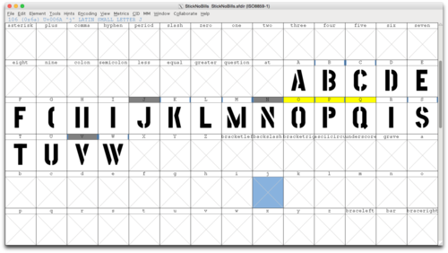
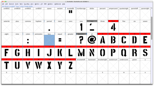
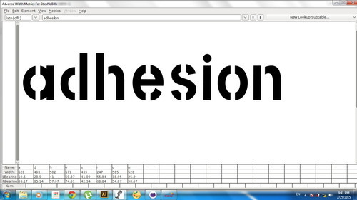
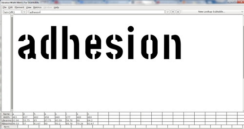
The lowercase sketched by the gallery's designers felt too far from the capitals, and the scratch pattern did not look right. We redrew it, matching the blacks while keeping the condensed quality.

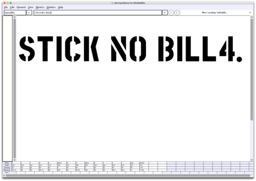
v001
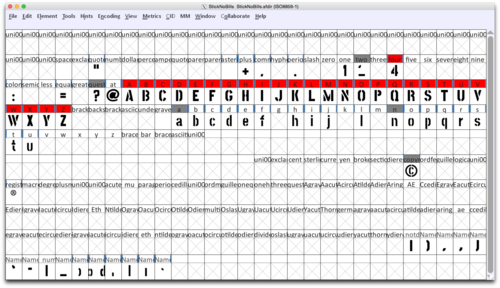
After many iterations, v001 went out on 20 March 2015, with a project page, a demo video and all files on GitHub. Most of the work was drawn by Kosala Senevirathne.
Watch the demo video · Process videos on YouTube
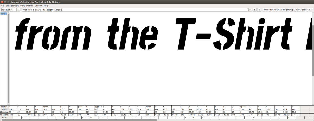
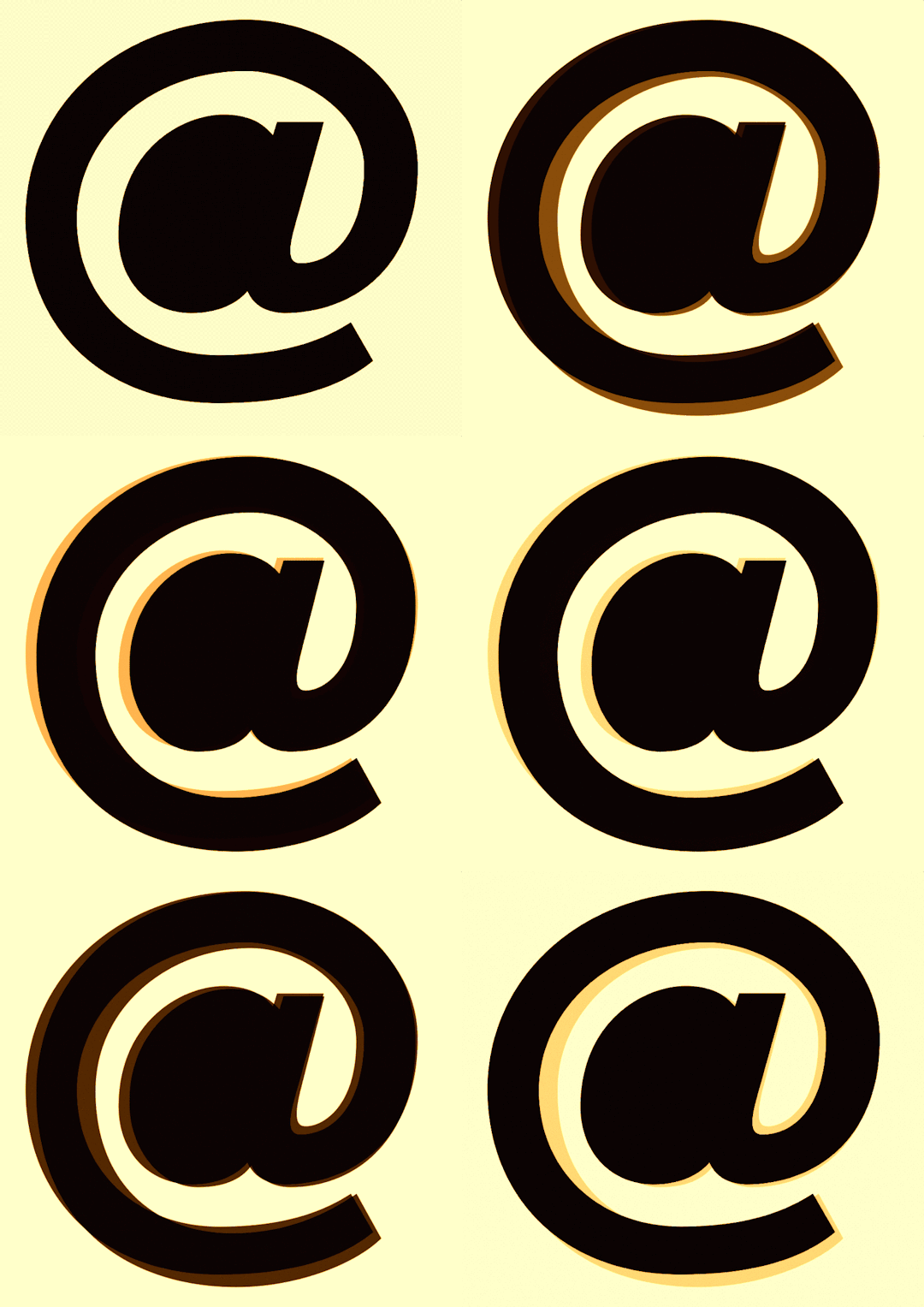
Italic
Sinhala
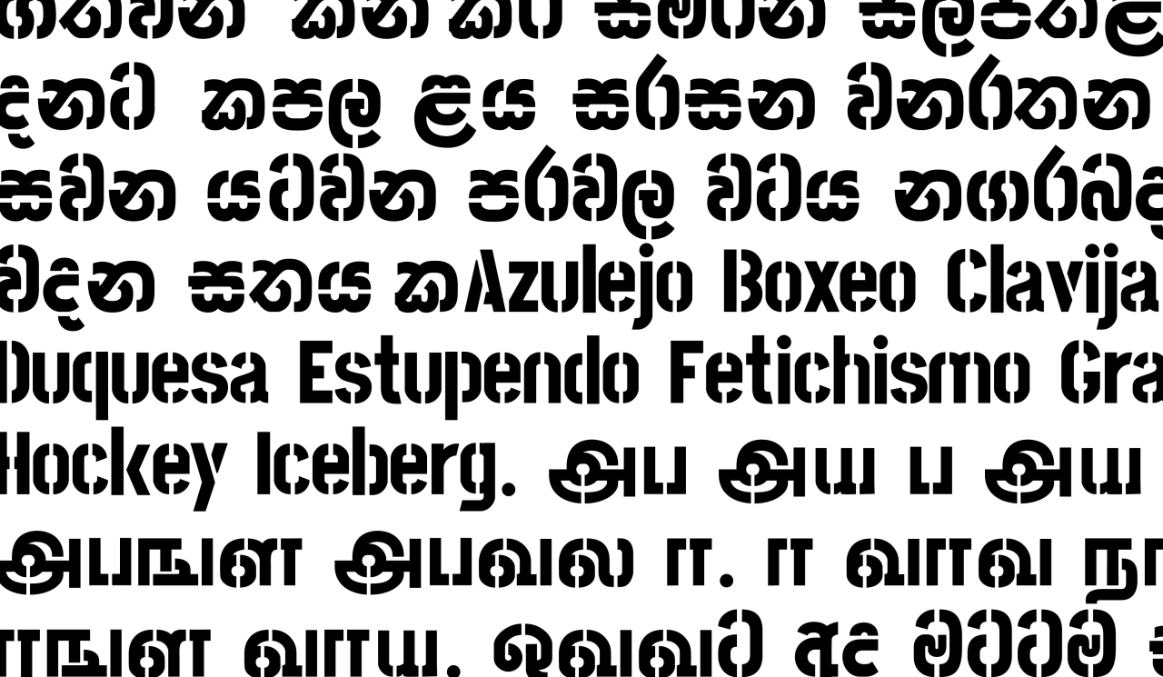
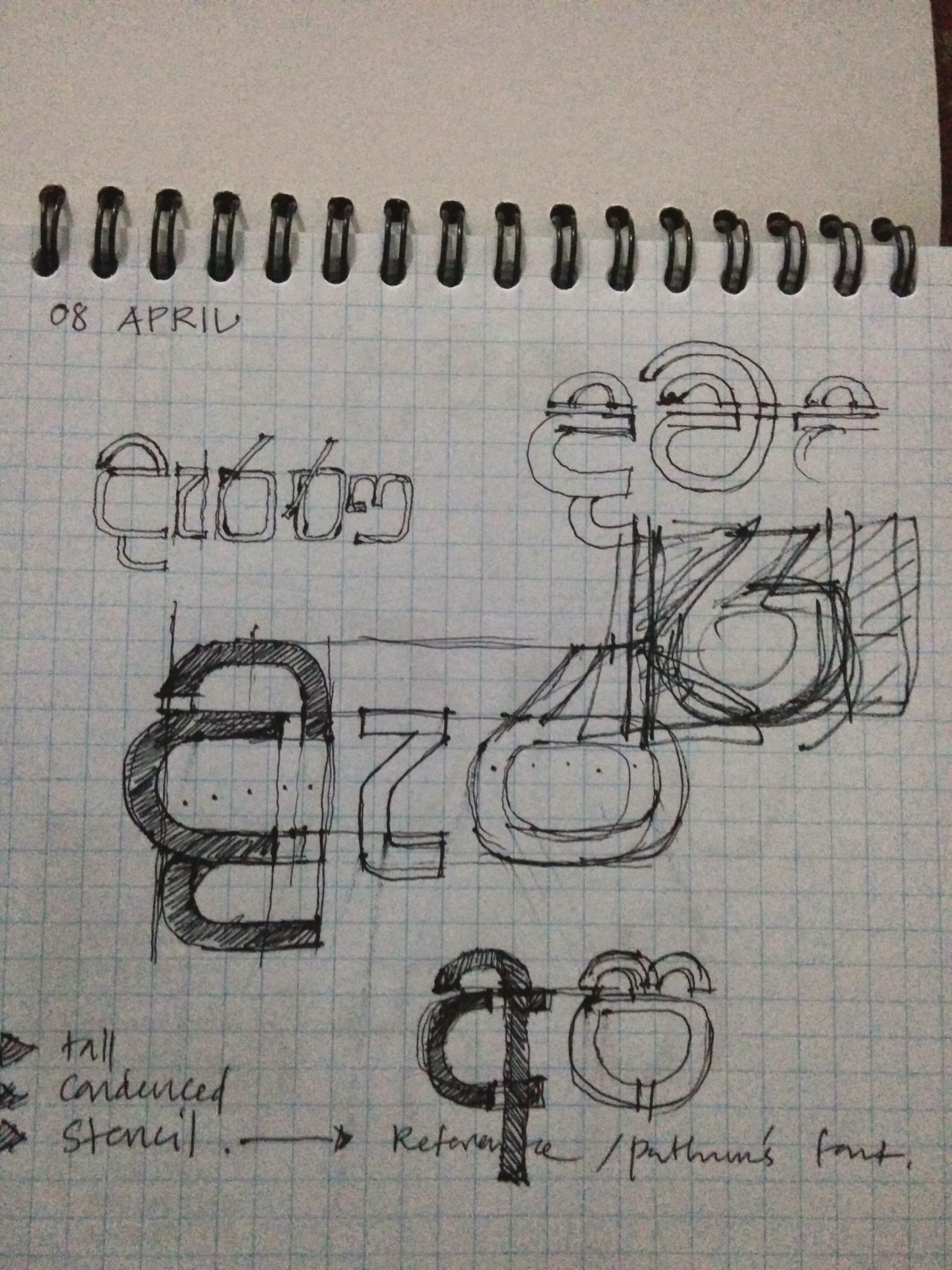
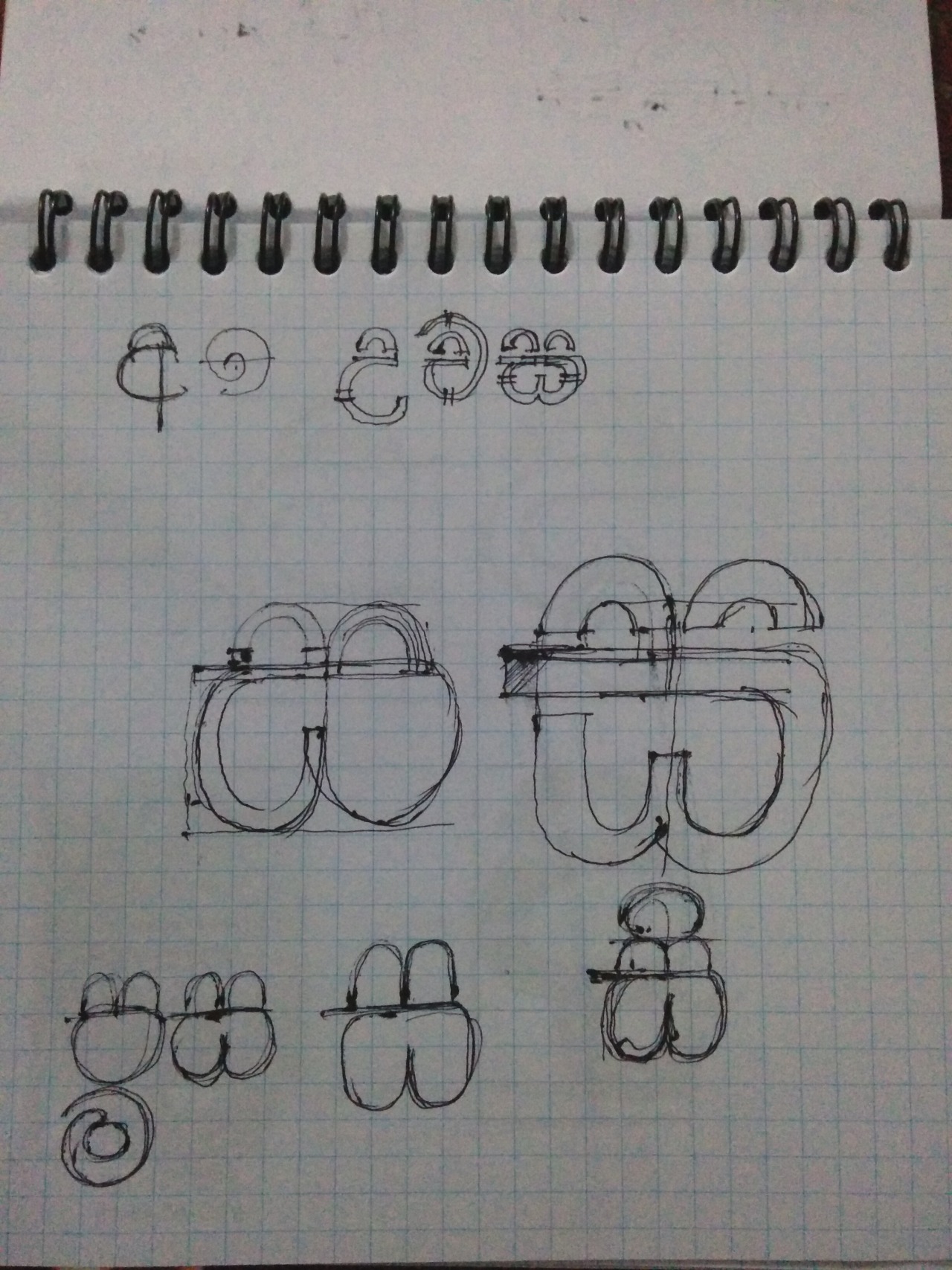
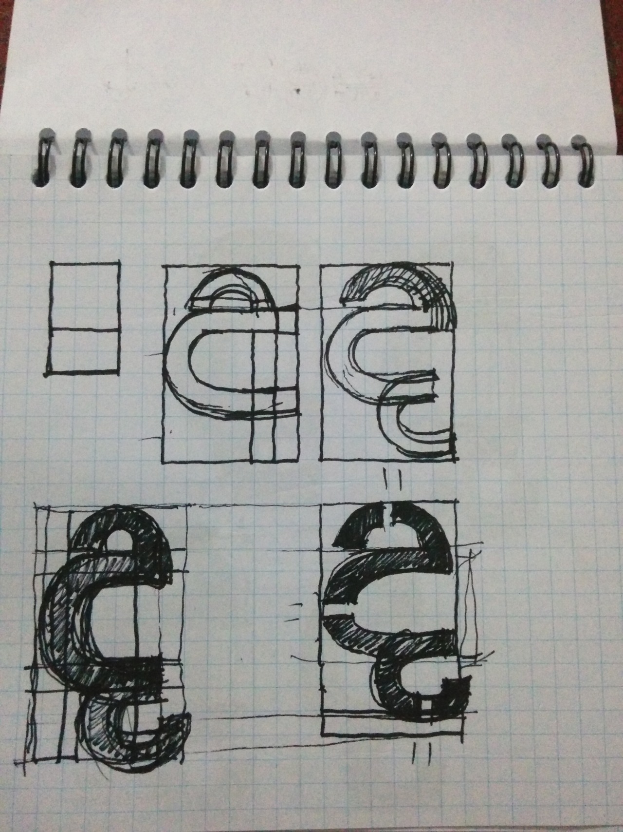
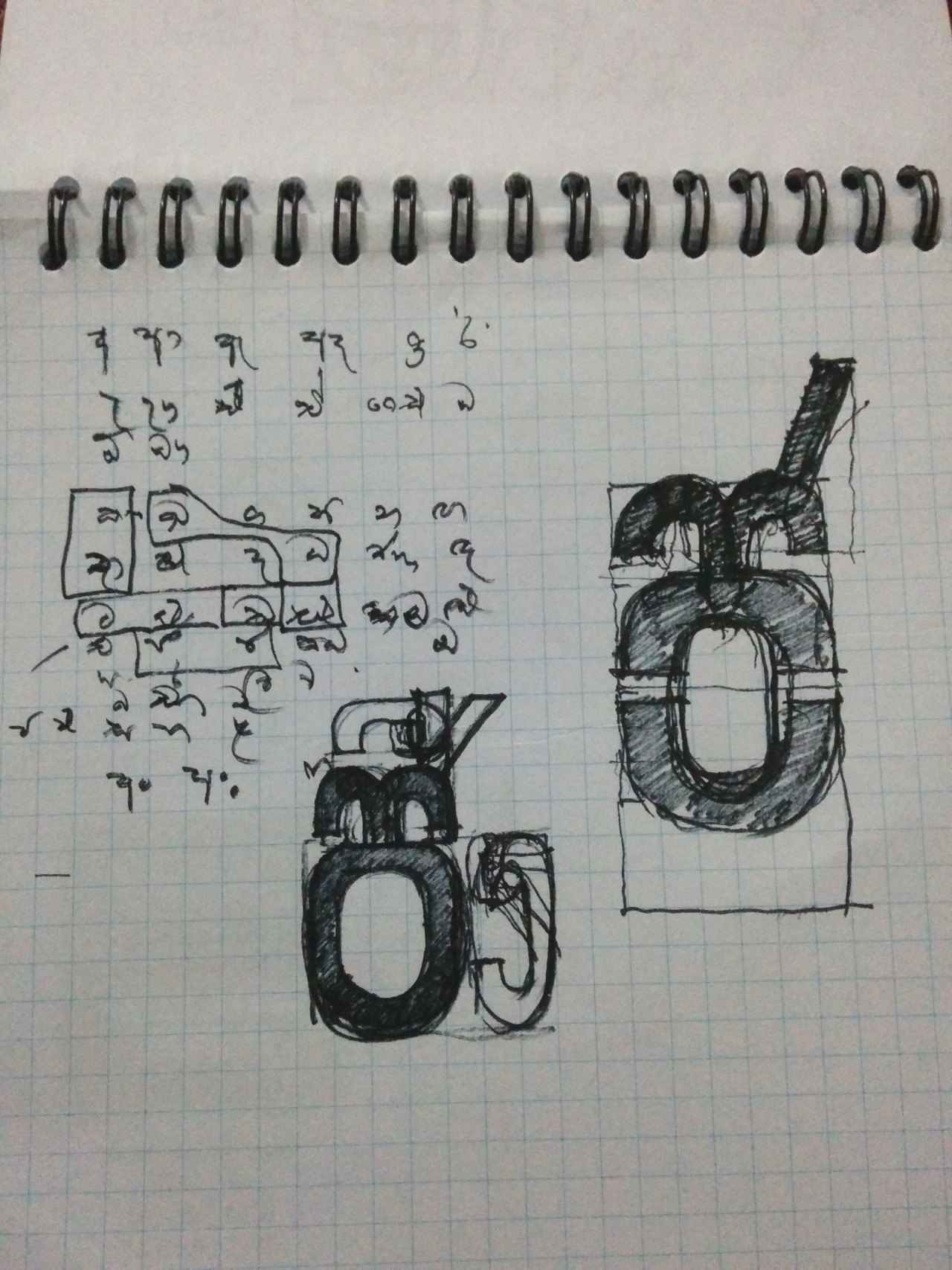
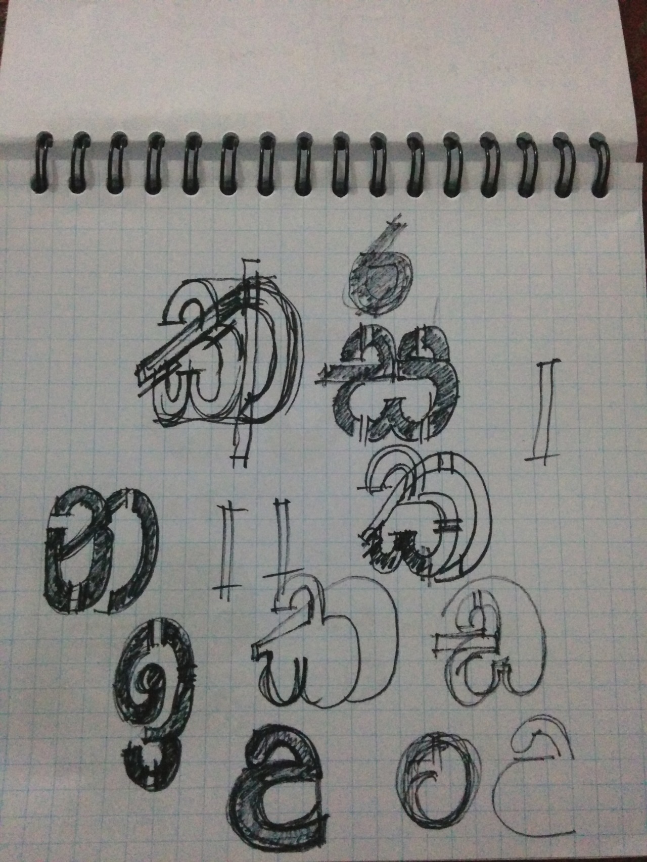
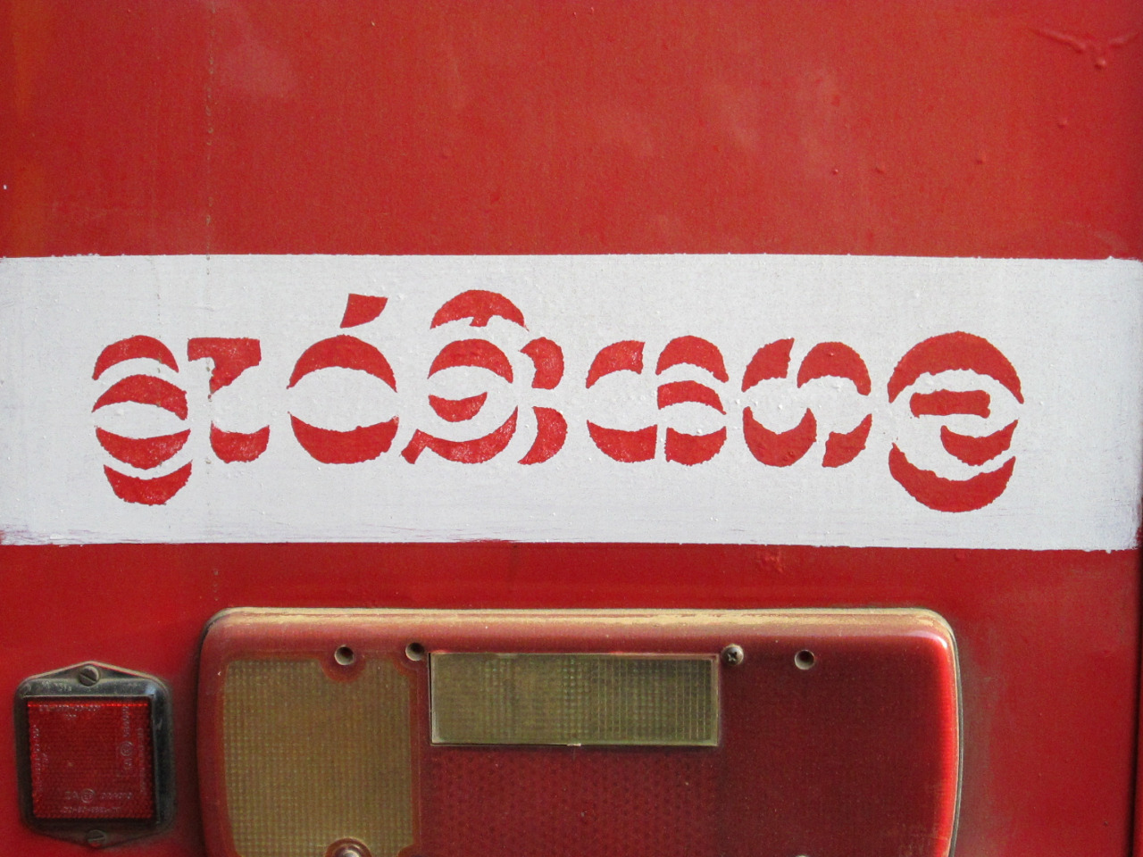
We then expanded Stick No Bills into a multilingual family, starting with Sinhala. There was no Sinhala stencil font. The only benchmark was the stencil lettering on railway stations and buses, where cuts land in all the wrong places. Having studied the wide variety of stencil typefaces visible at street level, with special attention to the Sinhala and Tamil lettering stenciled on the walls of railways and bus stations, the team built the letters of all three alphabets from the stencil structure up.
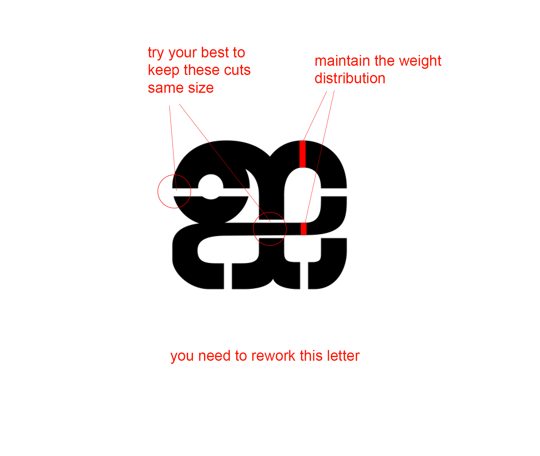
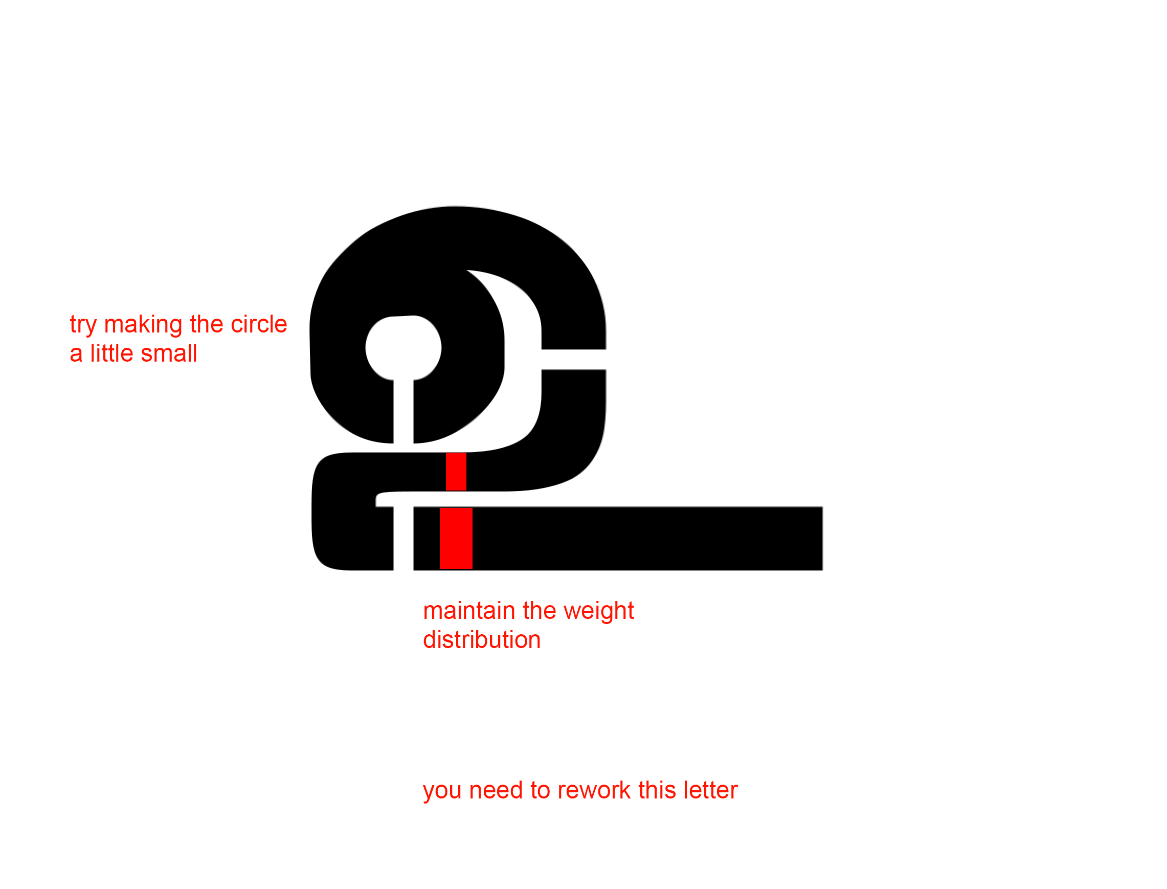
Review
Annotated Sinhala letters from the development repository.
Light
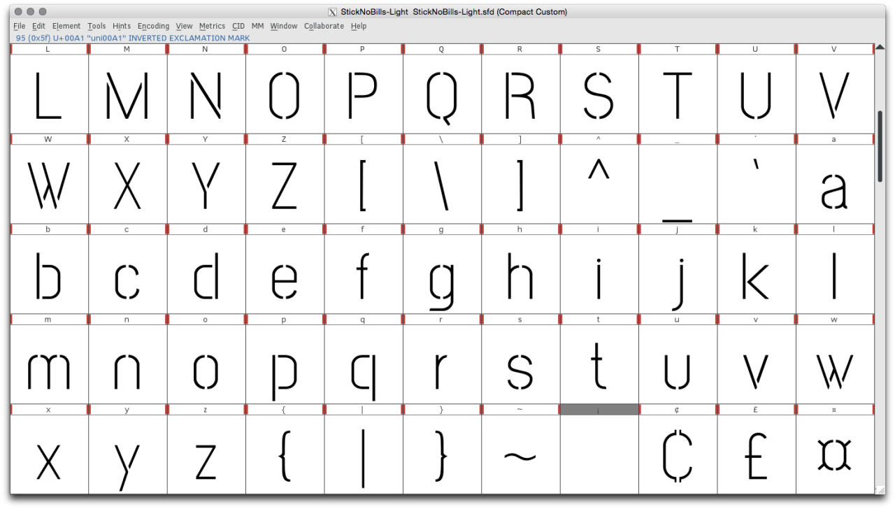
The family grew to six weights, from Extra Light to Extra Bold. Tamil followed, with a separate Jaffna set pairing Tamil and Latin.
Release
The font was released on the Google Fonts platform in October 2021. The development of the project is fully documented, and all the material is on GitHub. Following the open nature of the project, Stick No Bills and Mooniak welcome any improvements.
We hope you will enjoy using it as much as we do!
Credits
The project was led by Mooniak. Pathum Egodawatta and Kosala Senevirathne were responsible for Latin and Sinhala design. Lasantha Premarathne further expanded the Latin. Siva Puranthara and Tharique Azeez created and tested the Tamil design. Pathum Egodawatta and Ayantha Randika provided technical consulting and overall management. The first Latin capitals were drawn by Martyn Hodges. Special thanks to Meg and Philip James Baber of the Stick No Bills gallery for making the font open and free for all.