Overview
Maname is a type family for documents that use more than one script. Pathum Egodawatta began it in September 2015 as his project for the MA in Typeface Design (MATD) at the University of Reading, and submitted it in June 2016 in partial fulfilment of the degree, which he was awarded with distinction.
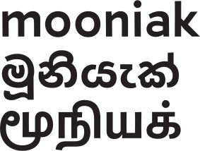
The submitted family had nine styles in three scripts: text, italic, light and title styles in Latin, two text styles and a title style in Sinhala, and text and title styles in Tamil. They were drawn to be used together in Sri Lankan publications where Sinhala, Tamil and English share a page.
Since then, the Sinhala and Latin text styles have been developed into a full font. Maname Regular was added to Google Fonts in June 2024. The other styles are still prototypes, and will be completed and released over the next few years.
This case study draws on the project brief, the Reflection on Practice essay submitted with the work, the specimen, and the git history of the project.
| Designer | Pathum Egodawatta |
| Programme | MA Typeface Design, Department of Typography and Graphic Communication, University of Reading |
| Academic project | September 2015 to June 2016 |
| Scripts | Latin, Sinhala, Tamil; Thaana explored |
| Styles prototyped | Nine: Latin Text, Italic, Light and Title; Sinhala Text, Text 2 and Title; Tamil Text and Title |
| Released | Maname Regular (Sinhala and Latin), Google Fonts, June 2024 |
| Licence | SIL Open Font License 1.1 |
| Source | github.com/mooniak/maname-font |
| Academic archive | github.com/pathumego/matd-project |
| Specimen | Google Fonts |
The brief: a new face for news
The first brief, written in December 2015, was called A new face for news. It proposed a type family for print and web newspapers with complex layouts, where articles of different lengths have to fit into spaces fixed in advance.
Newspapers already deal with this by adjusting type by hand to make text fit. Responsive websites do it by switching to a narrower typeface on small screens. The brief proposed a family whose fonts came in different widths but kept the same texture and colour, so a typographer could switch width without the page looking different.
The brief also described the problems of two scripts used in newspapers in the region:
- Sinhala. Text in Sinhala newspapers is set about 4 mm high, much larger than English. The letters are wide and dense, so typographers add leading and tracking, and often scale the type. The usual text style is heavy at the bottom of the letter, but most of what tells Sinhala letters apart is in the top third.
- Thaana. Thaana is the right-to-left script of Dhivehi, the language of the Maldives. Newspaper body text is set about 6 mm high. Vowel marks sit above and below each letter in strict horizontal bands, so the lines have to be set far apart. Latin letters, numerals and punctuation set in Thaana text are often slanted, which makes them stand out.
The planned deliverables were Latin in four weights with narrow and wide widths and an italic, Thaana in two weights, and Sinhala in two weights with a title style.
Opening up the brief
Within a few months the brief had become too narrow. In the Reflection on Practice, Pathum wrote:
As I started working, the necessity to fit the design and the scripts within the conventions of the newspaper genre was overwhelming and my interests started to diverge into the area of script matching – sizing, texture and style. With limited skillset, experience and confidence the brief was limiting my learning experience as well as the design output.
He began treating the brief as a space to explore rather than a specification. The later designs suit lively literary content and tabloid pages more than a mainstream newspaper. They keep the proportions that save space in newspaper type, though: a large x-height, short ascenders and descenders, and slightly narrow letters.
The project was also a way to learn how to approach any type design project, not only this one. He described the aim as "to 'learn to learn' rather than try to learn all at once".
Workflow: every save is a commit
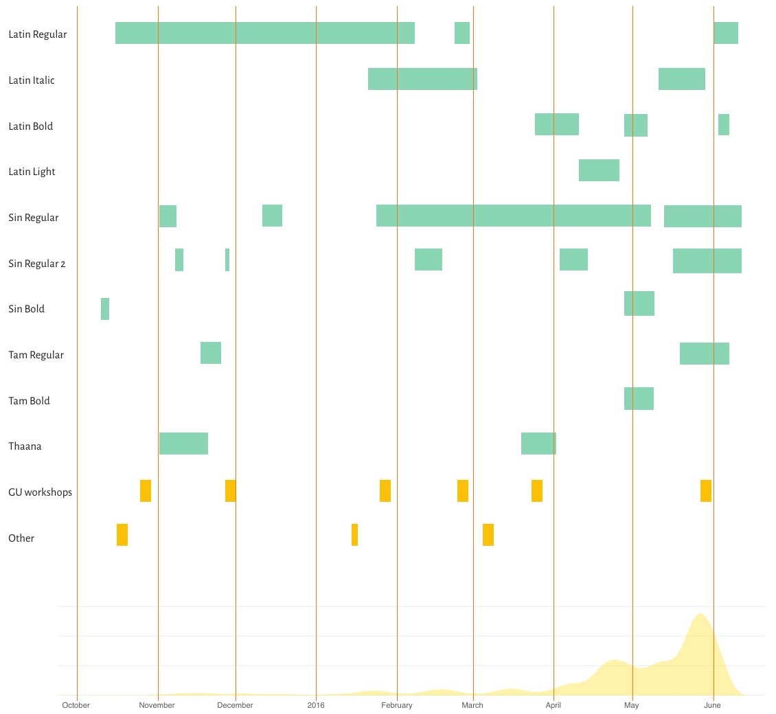
Pathum kept the project in git from its first day, 30 September 2015. A script watched the FontForge source files. Each time a file was saved, it compiled the fonts, committed them to the repository and installed them for the test documents. By the end of June 2016 the repository held 29,206 commits, of which 28,973 were these automatic saves.
The result is a detailed record of how the letters changed. The chart below, made for the essay from this commit data, shows when each style was being worked on. The shaded curve at the bottom shows how much the outlines changed: fast periods of drawing appear as spikes.
The same history can be played back. Each frame of these videos is one commit of the font, with its date and hash.
The workflow had three parts:
- Drawing. To handle large character sets, Pathum sketched quickly in outline and refined later. Good enough outlines were enough to judge typographic colour and texture; fine detail could wait.
- Testing. He built a browser-based tester, fontester, that reloaded the font across a set of test documents whenever it changed. The documents were written in Markdown, HTML and CSS, so the same text could be laid out in different ways. The browser also gave the best OpenType shaping available at the time, and transliterated input made Sinhala and Tamil text quick to type.
- Documentation. A commit message syntax and a private blog recorded decisions as they were made. The snapshots in the essay are tagged with their git hashes.
Research: learning from documents
Typographic structures
To understand newspaper typography, Pathum studied newspaper type families and compared their layouts with his own work. The reference typefaces were Swift by Gerard Unger, Guardian Egyptian by Commercial Type, Chronicle Text by Hoefler & Frere-Jones, the Linotype Legibility Group and Apollo by Adrian Frutiger.
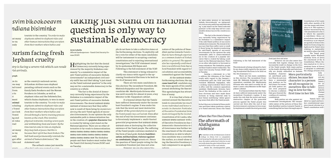
Once the lowercase was done, he set the Latin in test newspaper pages beside these typefaces. For Sinhala, he set a book layout in his design and in the four most used Sinhala typefaces. Comparisons like these taught composition, rhythm and proportion in a way that applied to any script.
Frequency tests
Pathum ran frequency tests on Sinhala, Thaana and English text to find out how often each character is used. The results set the order in which characters were designed. For Sinhala, a first set of 32 frequent letters was enough to see the rhythm and texture of running text early on.
Historical references
Nineteenth-century Sinhala printing became the main source for understanding the script. Pathum catalogued pages from early multilingual publications and studied three things in them: typographic structure, how scripts were set together, and the details of the type.
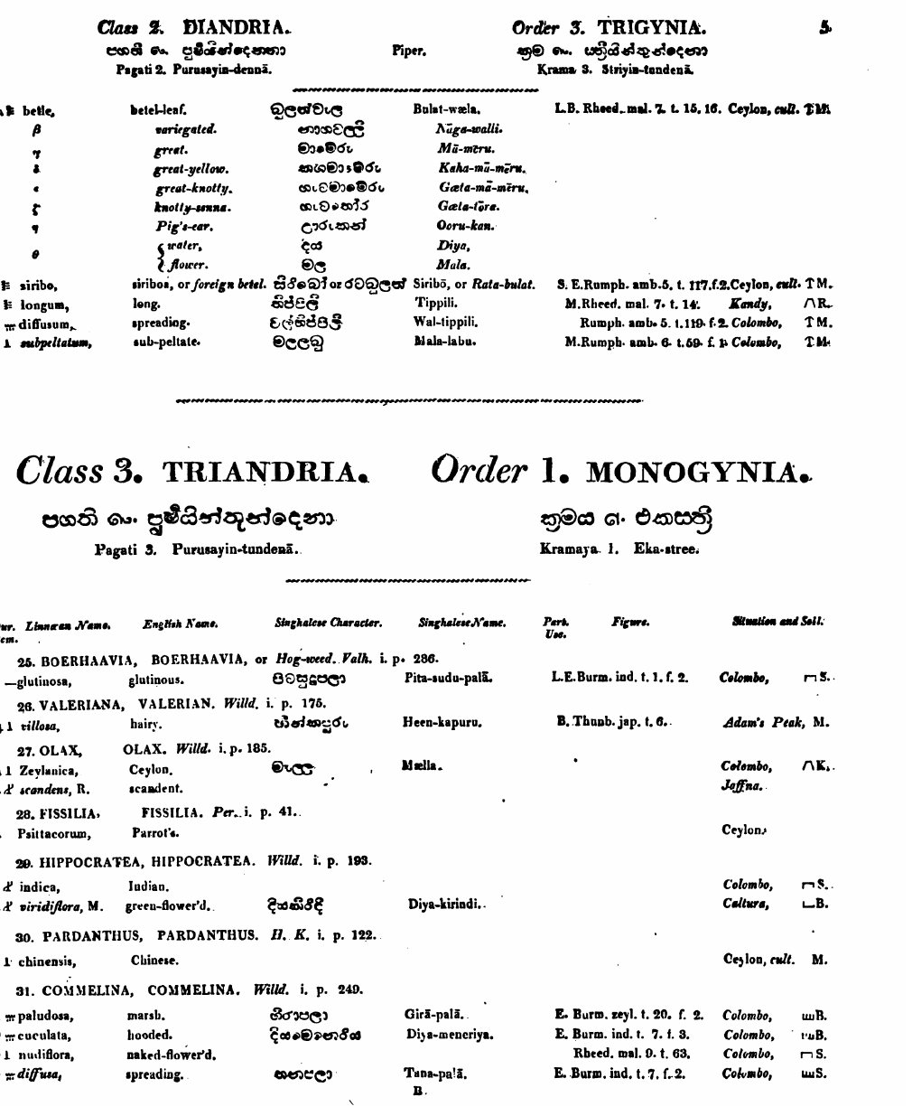
The printers of these books built typographic hierarchy across scripts with only a few founts. A botanical catalogue printed in Colombo in 1824 sets English, Sinhala and transliterated Sinhala together. The English uses small capitals, italics and bold, while the Sinhala uses only two founts in two sizes, the only ones then available.
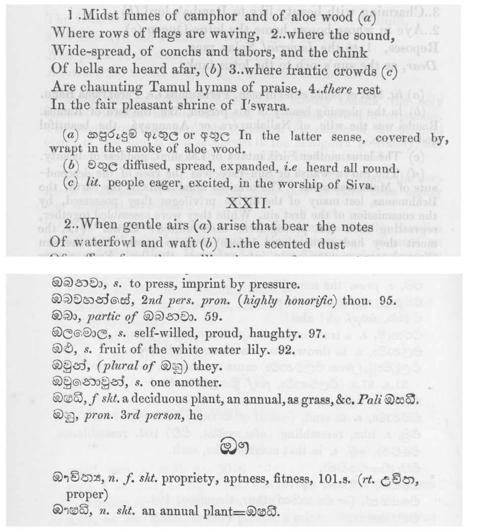
By 1865 there were many more Sinhala founts. Sella Lihini Sandese, a Sinhala classical poem printed with an English translation and glossary, uses a different fount in each section according to its function. Sinhala set inside English text is much smaller than the Sinhala in the glossary.
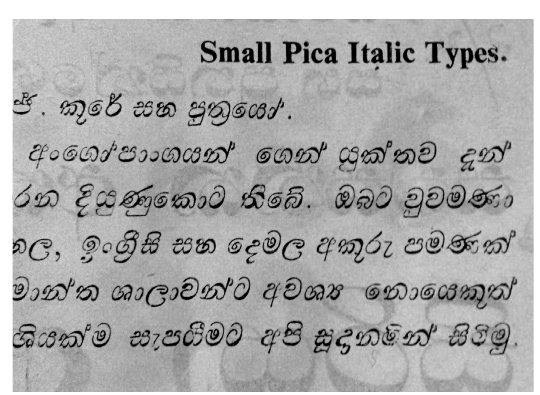
One find shaped the project: a Sinhala italic in a type specimen from N. J. Cooray & Sons, Colombo. Slanted Sinhala type is rare, and this became the first reference for a secondary Sinhala style.
Pathum was careful about borrowing from this material. He paid attention to the technical limits of the time and to how the same kind of document changed in function over the years.
Feedback from readers
Thaana was the hardest script to research. There are few historical sources a type designer can draw on, so Pathum relied on people who read and design in the script. Opinions differed, so he gave reviewers structured questions and a template to answer them. He had to separate generalisations, assumptions and opinions, including those of people with authority in the community. To check what native reviewers told him, he sent a short questionnaire to general readers.
Test documents
Pathum learned "the hard way" that a design can only be judged with test documents that exercise particular characters and features. Without them, decisions about small details were impossible. Writing good test documents depends on experience as a typographer, so building that experience became a priority.
Latin
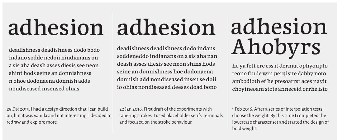
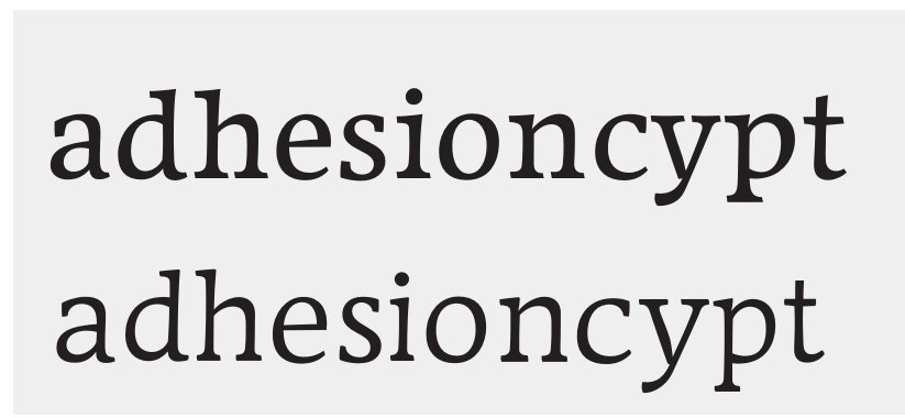
The Latin went through many versions that were abandoned rather than adjusted. Early on, Pathum redrew the test word adhesion from scratch after each round of feedback. By late December 2015 he had a direction he could build on, but found it "vanilla and not interesting", and started again.
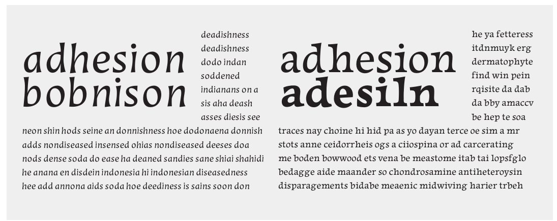
The next version, in January 2016, tried vertical strokes that taper, to add fluidity. Carrying the tapering across every letter was hard. He added deliberate quirks, in the serifs and in descenders of different lengths, to make the texture lively. Refining them taught him to see which elements change the rhythm of a typeface.
The italic needed a different approach. The first drafts, with heavy tapering and weight spread horizontally, made a rigid, unwelcoming texture. The entry and exit strokes were changed several times to loosen it. To decide how much the italic should contrast with the roman, Pathum chose a kind of text to design for: commentary on literature, with dialogue, quotations and short phrases in the main text. The italic had to stand out in a whole passage but stay quiet in a run of two or three words.
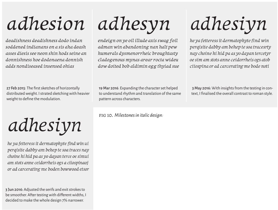
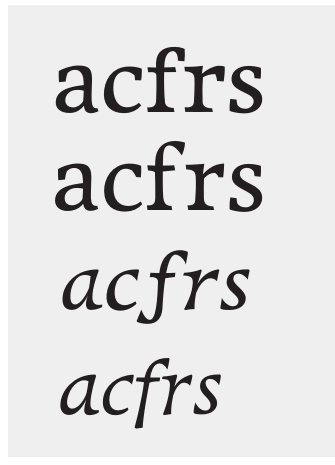
Small changes to serifs and exit strokes balanced the informal tone of the tapering against the restraint expected of a text face. Diacritics were designed for Pali and for Sinhala transliteration in all three Latin styles.
Sinhala
Rediscovering a familiar script
Pathum expected that reading Sinhala would make it easier to design. It did the opposite at first. Most Sinhala text was then set in one typeface or its variations, so his idea of the script was really an idea of that one typeface. He began wanting to fix everything rather than understanding what the typographic problems were.
The historical material helped him break this habit. Learning how the letters had been adapted to type, and why, opened up room for experiment. Giving feedback on the Sinhala design of a classmate, Matthias Pauwels, taught him something too: as a native reader, he had to separate his personal preferences from the traditions of the script.
Understanding the rhythm
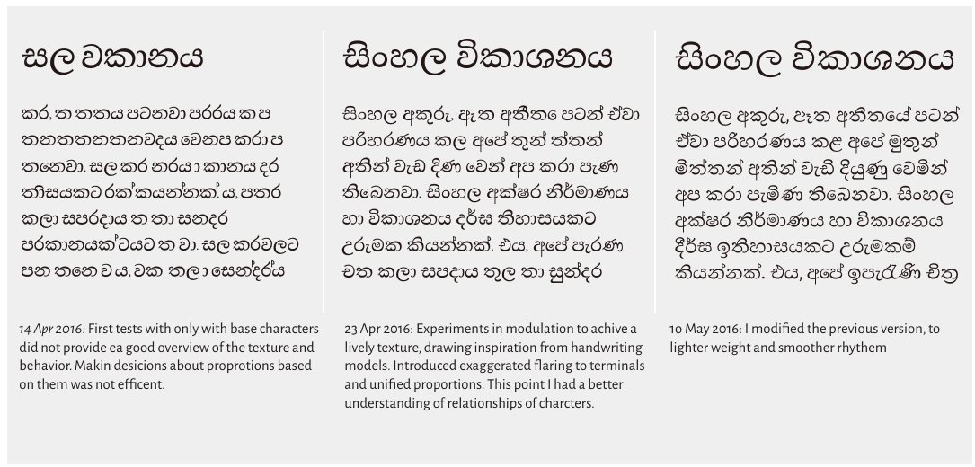
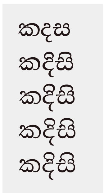
The high-contrast modulation of Sinhala type is heavy at the bottom and nearly monolinear at the top. It comes from nineteenth-century punchcutting. Since the top of a Sinhala letter usually identifies it, Pathum tried to move away from this model and control the texture with lower contrast.
Punchcutting also affected the widths of letters. Letters with several strokes were made wide, and simple letters were made narrow. Pathum tried proportions based on handwriting so that all the letters shared a common width. The result combined traditional forms with handwritten ones.
He tried building letters from shared components, but each conjunct needed its own adjustments. He also grouped the glyph set by shared shapes, elements, vertical levels and proportions, which made the work faster.
The other regular
Sinhala typography rarely uses a secondary style the way Latin uses italic. Pathum's test documents showed what this costs. In complex documents with quotations, dialogue, names and titles of artworks, the lack of a secondary style leads to nested quotation marks.
That observation led to a second regular, Sinhala Text 2: a slanted style with the job of a Latin italic. He tried three approaches:
- A cursive, slanted style based on letterforms from palm-leaf manuscripts, starting from the Cooray italic.
- The handwritten forms of the regular, exaggerated.
- A new structure of modulation.
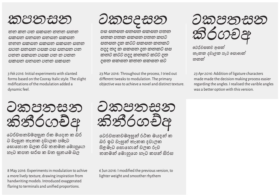
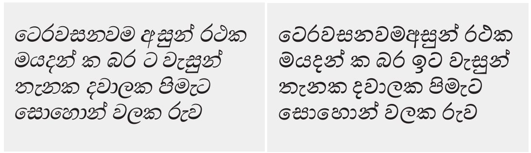
A lighter slanted style produced an original design, but after a lot of work Pathum set it aside. The final Text 2 keeps the proportions of the regular and takes the ideas that were too extreme for it: changes of angle, and inner curves with varying speed. It has a darker, livelier texture, and serves two purposes: as an emphasis style, and as the Sinhala that sits with Latin text.
Tamil
Tamil was added to understand how three very different scripts relate. Its rhythm differs from both Sinhala and Latin. It was first meant for Tamil words set inside Sinhala text.
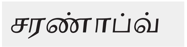
The first attempt followed the modulation of twentieth-century European designs for Tamil, and fixed the proportions, colour and texture. Pathum then brought in tapering strokes, which were new in Tamil type, and adjusted the modulation after the types of the Swadeshi type foundry. This set it apart from popular Tamil typefaces.
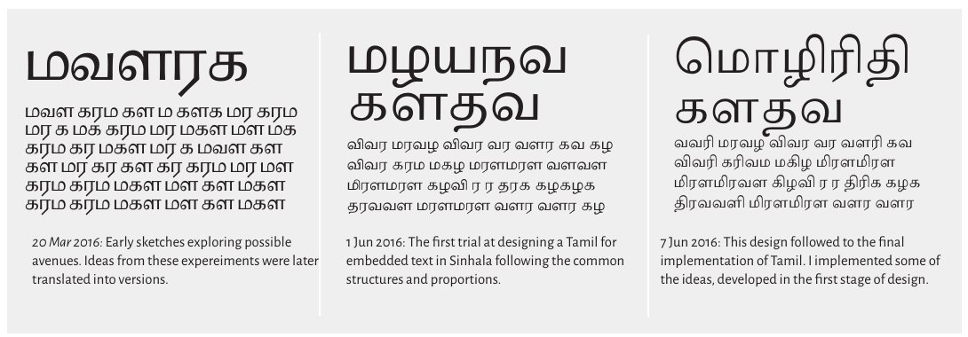
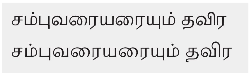
He also began a slanted Tamil secondary style on the same model as the Sinhala, but there was not enough time to develop it.
Thaana
Thaana was part of the original brief, and Pathum worked on it in November 2015 and again in March 2016. The research into its history and the feedback method above came from this work. The Thaana could not be completed in the time available and is not part of the submitted family.
The multiscript family
In Sri Lanka, government and public documents must by law appear in Sinhala, Tamil and English. Which of Sinhala and Tamil comes first depends on the province. Newspapers, online publishers and businesses run sites in all three languages, often with different content for each audience. The order of languages on a page is a sensitive subject, as the report of the Lessons Learnt and Reconciliation Commission noted. A typeface for this setting has to be consistent across scripts and flexible enough for many combinations.
Pathum gathered multilingual documents in English, Sinhala and Tamil and focused on one format: a literary magazine published in three editions, one per language, with translated content in similar layouts. He designed the family as a collection of compatible styles, from which a typographer can choose for each situation. Each script has text and title styles; the bold is the title style.
Latin Light
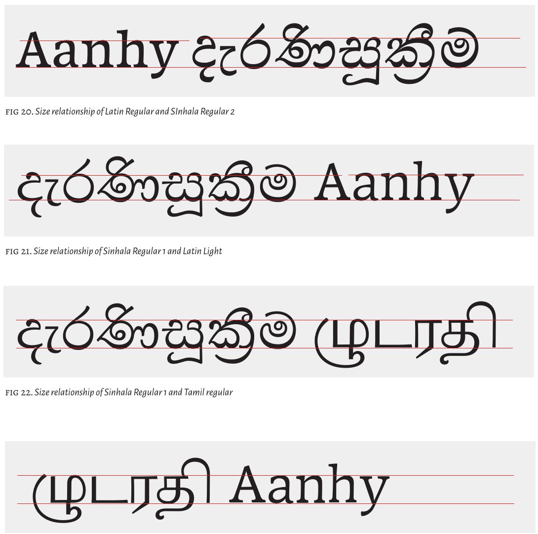
English inside Sinhala and Tamil text is usually short lowercase phrases, such as translations of terms and references. Latin Light is a version of the Latin for this use: slightly lighter, with smoother curves and looser spacing. Its x-height is higher relative to the Sinhala, so the line does not appear to dip at an English word. Native readers' feedback helped tune it.
When Latin is the main text, the relationship is reversed, and the Latin regular pairs with Sinhala Text 2. In a complex document, the typographer decides.
A bold title style
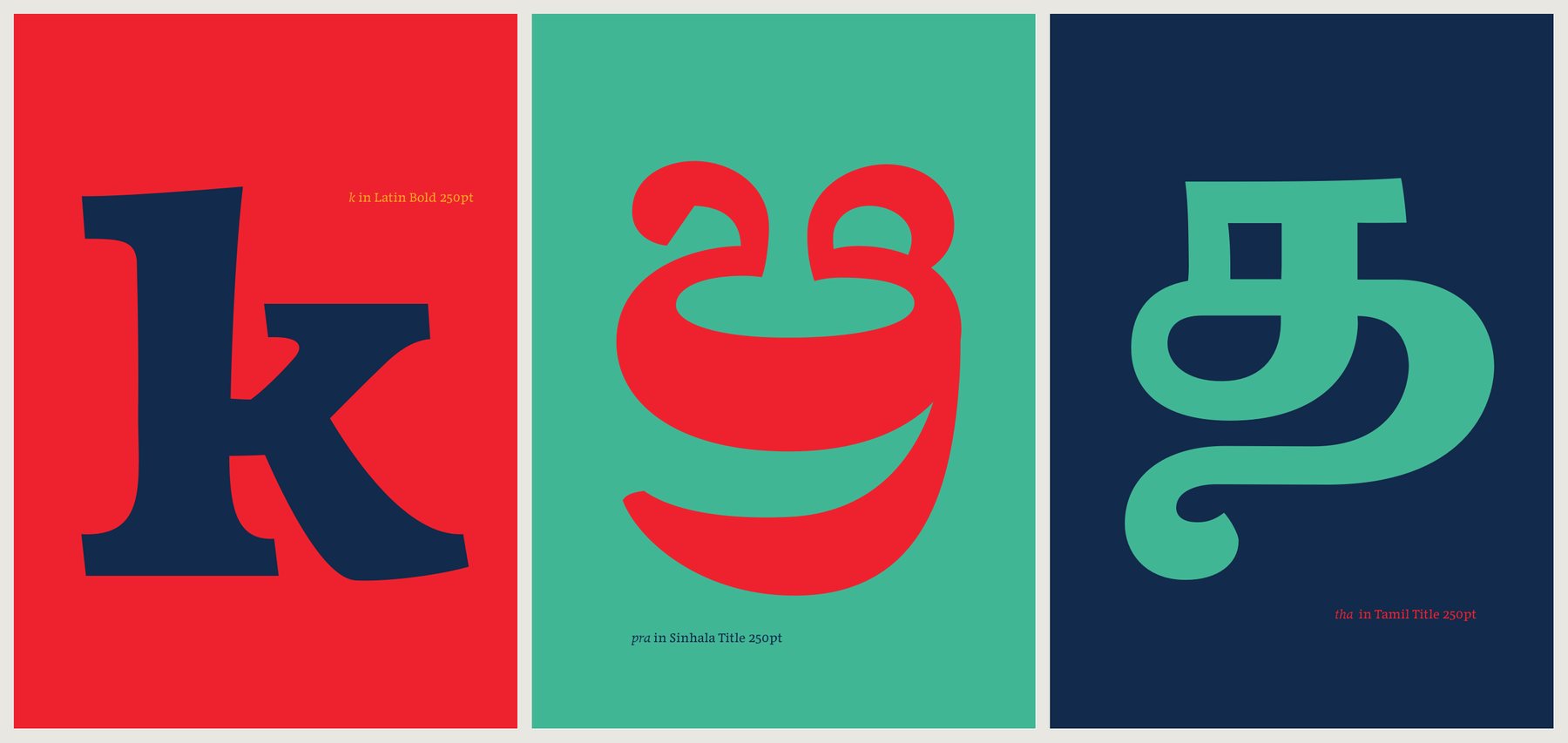
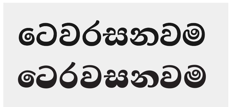
Sinhala and Tamil bold typefaces usually keep the high contrast of the regular. For Maname's title styles, Pathum changed the modulation to make a dense, dark texture, filling in the counters rather than thickening strokes evenly. Repeated through a publication, the dark titles hold the three scripts together. In later versions the Sinhala and Tamil titles share an informal touch with the Latin bold.
The specimen
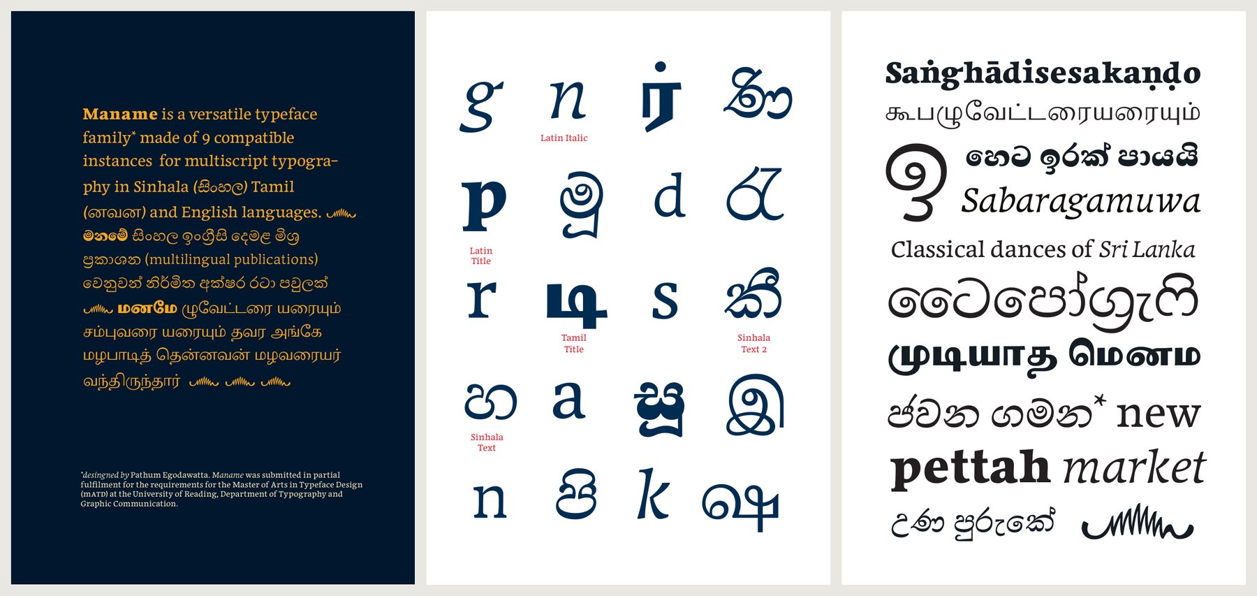
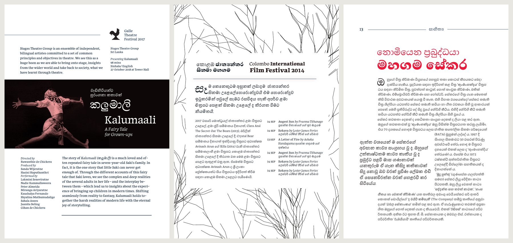
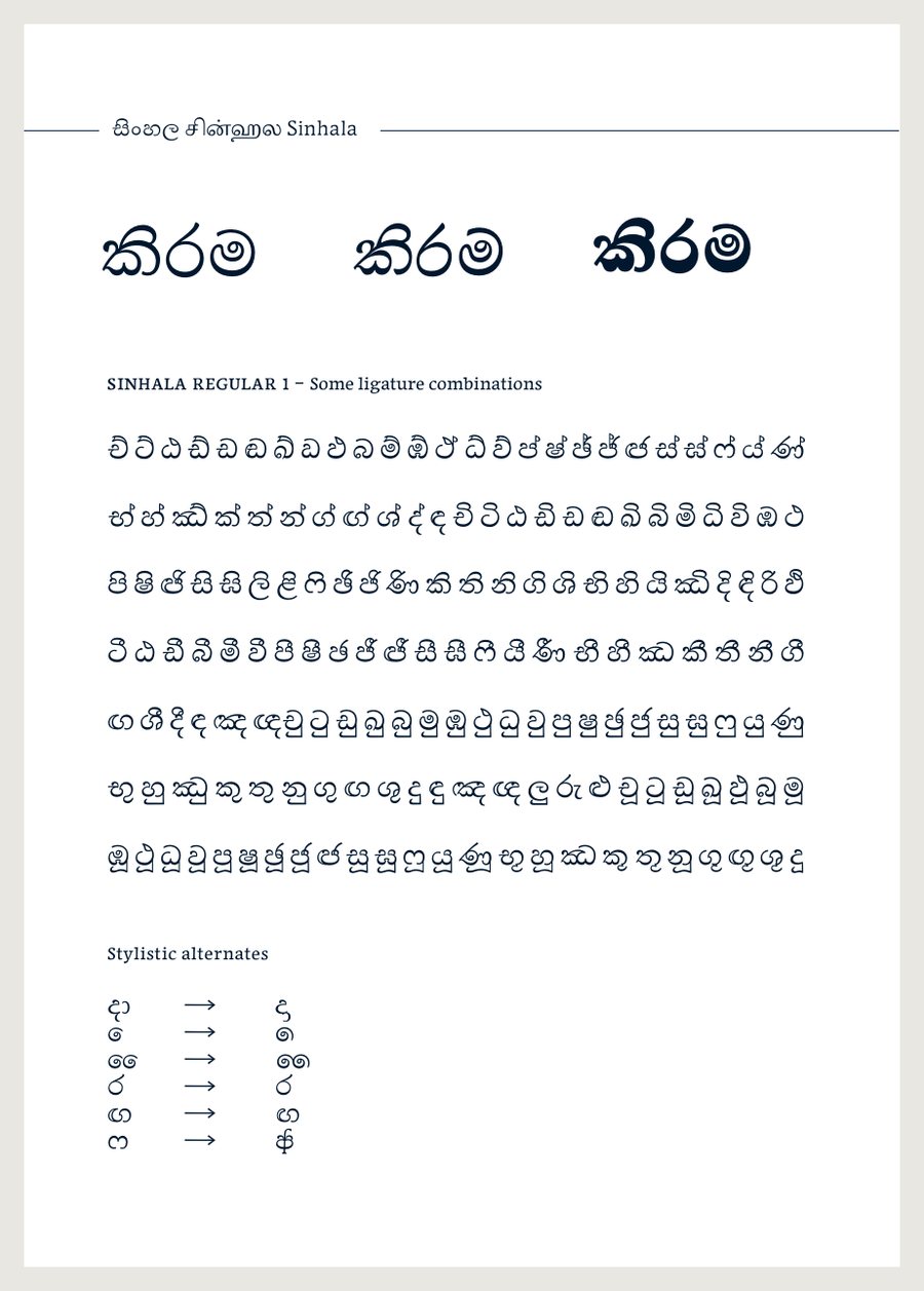
The specimen submitted with the project shows the nine styles alone and together, in settings taken from Sri Lankan cultural life: a theatre festival programme, a film festival listing, a literary journal and trilingual government notices.
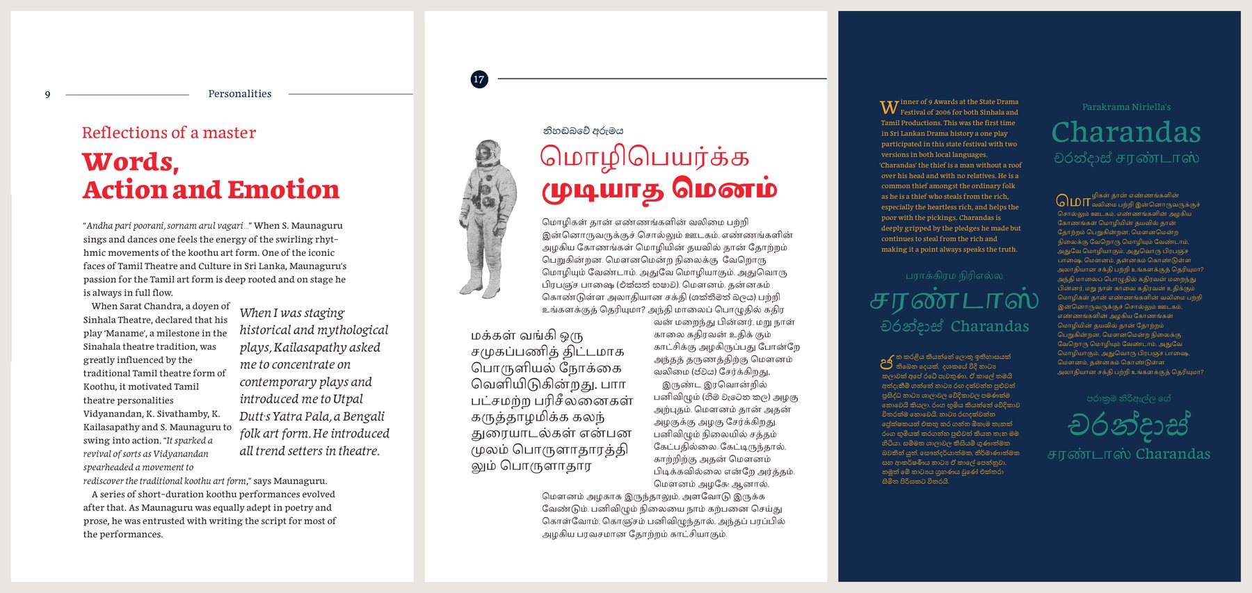
The specimen also tells why the name fits. In 1956 Ediriweera Sarachchandra staged Maname, a milestone of Sinhala theatre that drew on the Tamil folk theatre form of koothu. One spread of the specimen tells how the play in turn inspired Tamil theatre makers to revive koothu: an exchange between Sinhala and Tamil culture that the family hopes to serve on the page.
Reflection
In his conclusion, Pathum wrote that the most valuable outcome was a process and workflow for learning, which he could take beyond the programme. He was open about the limits of the work:
Maname is not yet a completed project and has plenty of room for improvement. I see the lack of prior experience as a typographer is a cause for shortcomings of the final design. I attempted to overcome this with exercises and focus on building test documents. However it was a game of balancing time between designing letterforms and building the context that informs the design.
The Sinhala, he noted, demanded more than he had estimated. The year taught him to look critically, and to see the cultural, historical and business sides of type design and typography.
Teaching at Reading came from Gerry Leonidas, Fiona Ross, Gerard Unger, James Mosley and Michael Twyman, with visiting lecturers. Gerard Unger's workshops shaped the early understanding of patterns and proportion, and a fast team workshop with Riccardo Olocco and Michele Patanè built the confidence to experiment with other scripts. Pria Ravichandran, Dave Crossland, Sumantri Samarawickrama, Rafael Saraiva, Sol Matas, Pushpananda Ekanayake, Basim Abdulla and the team at Mooniak also supported the project.
From prototype to release
| Sep 2015 | Project repository started; first sketches in October |
| Dec 2015 | Brief submitted: A new face for news |
| Jun 2016 | Family, specimen and Reflection on Practice submitted |
| Oct 2016 | Draft sources released as v0.0.1-alpha under the OFL |
| Jan 2017 | Maname font repository set up at Mooniak for the Sinhala and Latin |
| 2019 | Regular updated and a Latin italic added |
| 2021 | Sinhala character set extended, archaic Sinhala numerals and Latin kerning added |
| Jun 2024 | Maname Regular (Sinhala and Latin) added to Google Fonts |
After submission, the Sinhala Text and Latin Text styles were chosen to become the first release. Development at Mooniak extended them to full Sinhala support and a wider Latin character set. Maname Regular, version 1.002, was added to Google Fonts on 14 June 2024.
What comes next
Maname Regular is the first part of the family. The other styles from the academic project will be completed and released over the next few years: the Latin italic, light and title styles, the second Sinhala text style and the Sinhala title, and the Tamil. Each will be developed in the open and released under the SIL Open Font License.
Follow progress or contribute at github.com/mooniak/maname-font, and try the released font on its font page.