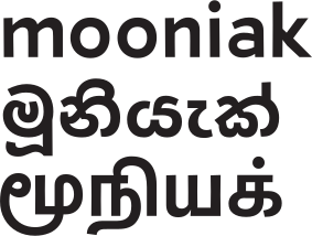
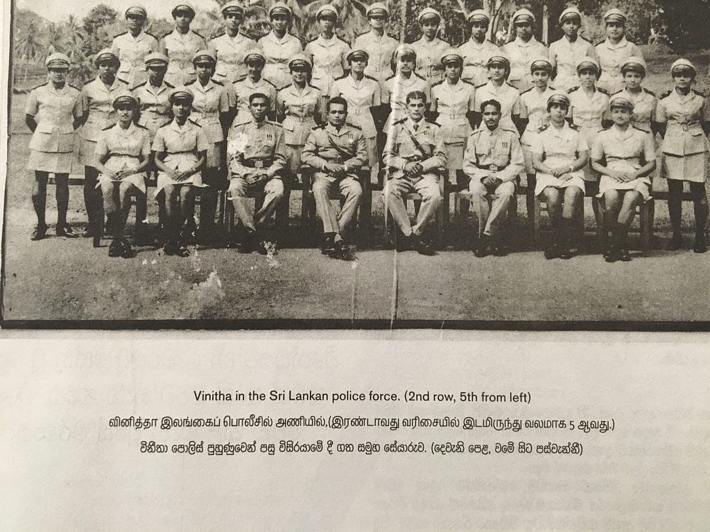
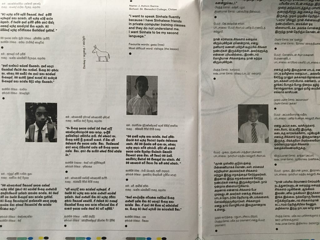
Catamaran is a Sinhala, Tamil and English multilingual newspaper published by the Media in Cooperation and Transition (MiCT). We collaborated with the international editorial team and Creative Director Chris Steurer, regarding font selection, typesetting, typographic design and production process. Our own Yaldevi font family was used for the newspaper, which marks its first major usage.
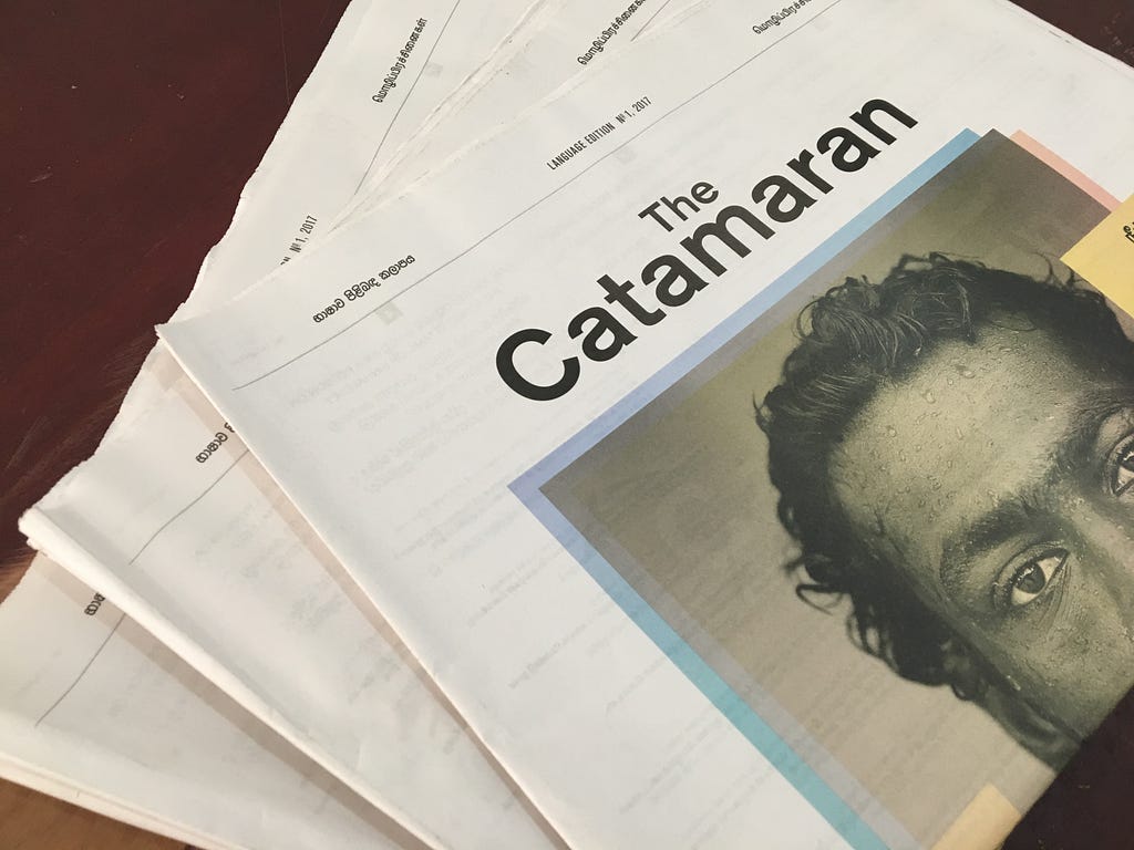
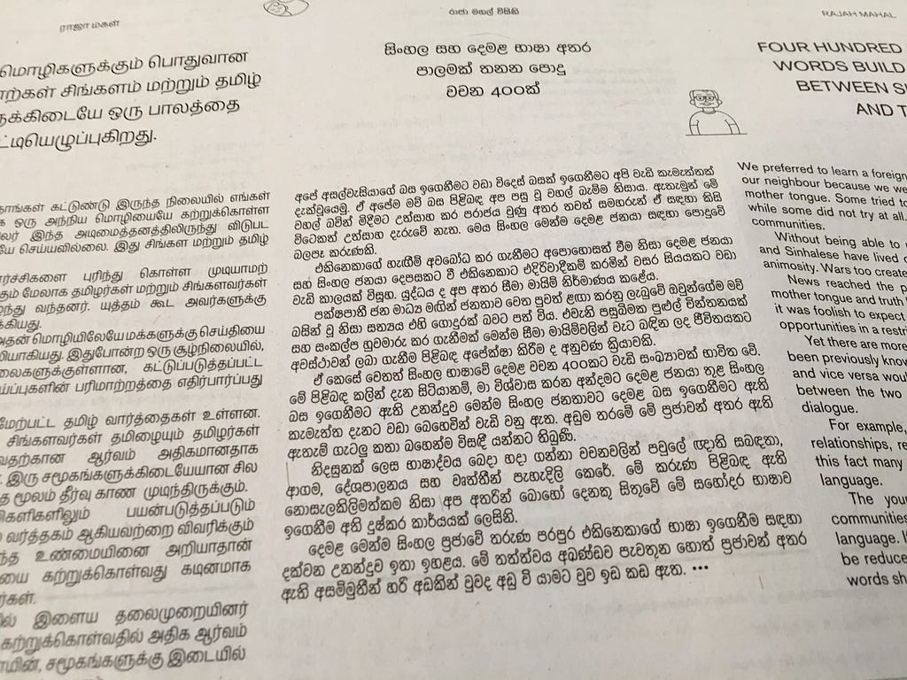
The primary challenge was to provide a harmonious aesthetic of the newspaper and the technical challenge of managing the project editorial team to provide Sinhala and Tamil typography consultancy.
Design and typesetting Sinhala Unicode texts in InDesign is a challenge and it become more when the team is working remotely and main stakeholder do not read the texts. However with a combination of Dropbox, Indesign template files and customised fonts we managed to develop a workflow that works for all the stakeholders editors and the designers.
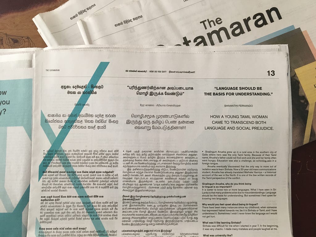
The Catamaran is a project run by Media in Cooperation and Transition (MiCT), together with the Sri Lanka Press Institute /Press Complaints Commission (SLPI/PCCSL) and Media Resource and Training Centre (MRTC) University of Jaffna. The project is funded by the European Union.
A balancing act; typography of a trilingual newspaper was originally published in moonLog on Medium, where people are continuing the conversation by highlighting and responding to this story.