Abhaya Libre: one family in Sinhala, Tamil and Latin
Overview
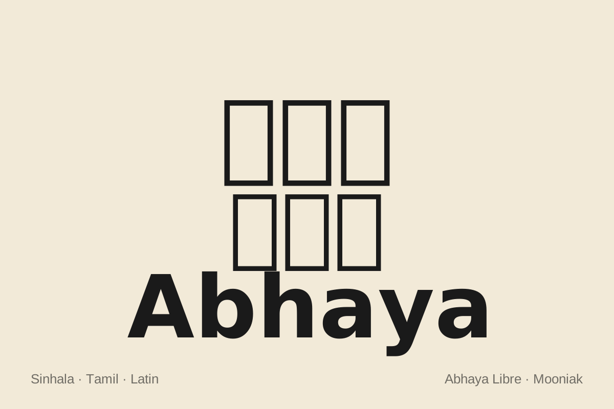
Abhaya Libre is an open source text typeface for Sinhala, Tamil and Latin. It began in 2015 when Google Fonts commissioned Mooniak to make a new Sinhala web font with a companion Latin. We built it by liberating FM Abhaya, the most widely used Sinhala typeface, and redrawing it from scratch for screens with its original designer, Pushpananda Ekanayake.
The result was the first Sinhala type family released in multiple weights, and the first in which the Latin was drawn to match the Sinhala rather than borrowed from elsewhere. A decade on, it remains the most advanced trilingual font available for Sri Lanka.
Client
Google Fonts
Studio
Mooniak, Colombo
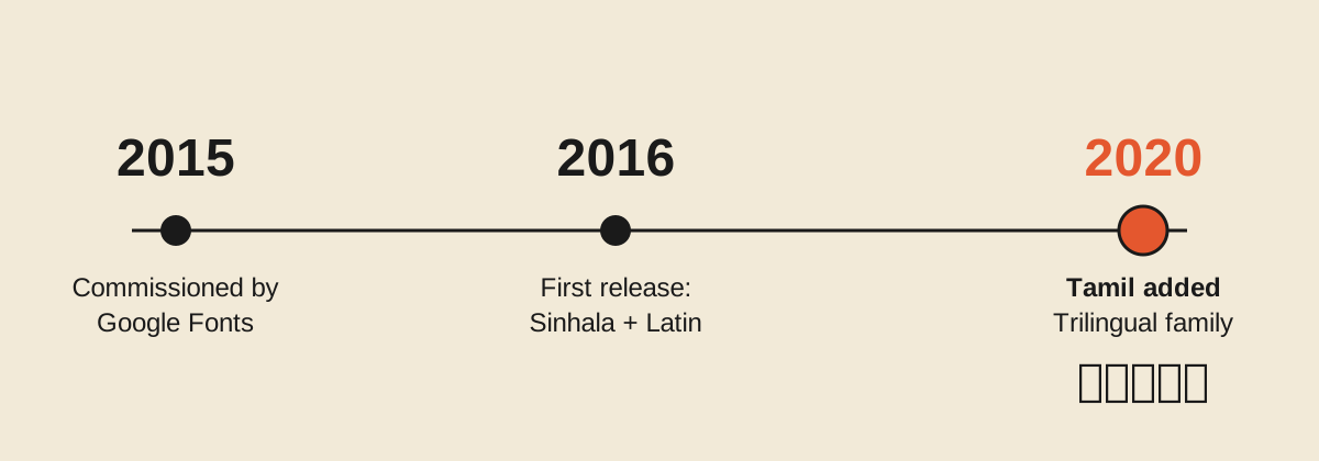
Commissioned
2015
First release on Google Fonts
2016
Scripts
Sinhala, Latin (2016); Tamil added 2020
Languages
Sinhala, Pali and Sanskrit in Sinhala script, Tamil, English and other Latin-script languages
Google Fonts asked for a new open source Sinhala typeface for the web, with Latin letterforms designed alongside it. In 2014 Google had begun expanding its font service across South Asia and engaged Pathum Egodawatta to advise on Indic language projects. A year later, the conversation became a commission.
The brief carried three demands at once:
Readable on screens. Text had to hold up on websites, tablets and small smartphone displays, not only in print.
Unicode compliant. The font had to store Sinhala as real text that can be searched, copied, spellchecked and read aloud.
Free to use and adapt. Everything had to be released under an open licence, so anyone could use, study or extend it.
It was Mooniak's first project of this scale, and the technical challenges were new to the studio.
Context: a classic trapped in a legacy format
FM Abhaya, released by Pushpananda Ekanayake in 1996, became the most printed Sinhala text face in Sri Lanka. Its letterforms follow the text style of the Department of Government Printing from the 1970s to the 1990s. That style traces back further, to N. J. Cooray and the Cooray Type Foundry in the late 1800s.
FM Abhaya was built for an era of 256-slot fonts. It placed Sinhala letters in slots meant for English ones, an ASCII workaround that looked right on paper but stored meaningless text underneath. Documents set in it could not be reliably searched, shared across devices or read by screen readers. Its glyph set was also limited, and it came in a single weight.
The typeface Sri Lankans knew best was locked inside a format the web could not use.
The name Abhaya comes from King Abhaya, who ruled from the ancient kingdom of Upatissa Nuwara (474 to 454 BCE).
Approach: liberate, then rebuild
Rather than start from a blank page, we chose to free the typeface people already read. With funding from Google Fonts, Mooniak acquired the rights to the FM Abhaya outlines so they could be released under the SIL Open Font License. Pushpananda Ekanayake joined the project and led the design of the Sinhala.
The project followed the spirit of the libre fonts movement: bring existing work and a group of designers together into one coherent typeface. The team set out to:
Redraw FM Abhaya from scratch for screen use, keeping its character.
Expand the single weight into a family of five.
Extend the character set to cover complex forms in Sinhala, Pali and Sanskrit.
Design an original Latin to sit with the Sinhala.
Engineer the whole family as a Unicode compliant OpenType font.
Working with the original designer meant every change could be tested against the intent behind the letters, not only their outlines.
Sinhala: a familiar voice, redrawn for screens
The Sinhala keeps the strong modulation of FM Abhaya, with strokes that swell and thin as they turn. This contrast, inherited from the letterpress tradition, is what readers recognise as the voice of printed Sinhala.
Every glyph was redrawn rather than converted. The new outlines were tuned for web, tablet and smartphone sizes, where the original's print details would blur.
ysFM Abhayays
හිAbhaya Classic
හිAbhaya Libre
කියවීමේදී ඇසට පහසු වන ලෙස වැඩි දියුණු කළ අකුරු.மேம்படுத்தப்பட்ட எழுத்துகளுடன் இலகுவான வாசிப்பு அனுபவம்.Comfortable reading experience with the new improved character set.
The five weights let designers build real typographic hierarchy for the first time in Sinhala: lighter weights for body text, heavier weights for headlines and subheadings. Before Abhaya Libre, no Sinhala typeface offered a family like this.
අඅඅඅඅஅஅஅஅஅaaaaa
පැහැ අන්තර පහකින්!ஐந்து எடைகளில்!Abhaya Libre comes with 5 weights. Regular, Medium, SemiBold, Bold & ExtraBold
Separate letters with spaces. Hover a letter to see its weight.
Type into any line.
Latin: drawn to match, not copied
Argentine type designer Sol Matas designed an original Latin to sit with the Sinhala. Its high contrast echoes the thick to thin strokes of Abhaya, adapted to the visual logic of Latin letters. Some terminals follow the ductus of Didone typefaces and carry a touch of Sinhala form. Large counters and short ascenders and descenders keep it clear on screen.
The aim was to reduce dissonance between scripts, an approach we call multiscript typography. Shared features are interpreted, not pasted across. The teardrop terminal of a Sinhala letter reappears in the Latin as a related gesture, not a duplicate shape.
Curves were matched by feel rather than by numbers. We did not copy curve values from one script to another. Instead we compared the speed of each curve, asking whether a cyclist riding along a Sinhala stroke and a Latin stroke would feel the same rhythm.
Abhaya Libre was the first typeface in which the Latin was designed to match the Sinhala in this way.
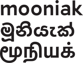
එකිනෙක ගැලපෙන සිංහල, දෙමළ, ලතින් අකුරු.ஒன்றோடொன்று இயைந்த சிங்கள, தமிழ், லத்தீன் எழுத்துகள்.Pair Sinhala, Tamil & Latin styles seamlessly.
Mix scripts on any line.
Tamil: completing the trilingual family
Sri Lanka communicates in Sinhala, Tamil and English, so a national text face needs all three. The Tamil character set was added in 2020, building on an open source Tamil typeface from Modular Infotech in India. Mooniak acquired the rights, then refined and integrated the Tamil so all three scripts work as one family.
Tamil was added to Abhaya Libre in 2020.
The same multiscript principles apply: related contrast, rhythm and colour on the page, so a trilingual document reads as one voice.
The largest technical shift was moving from FM Abhaya's ASCII encoding to full Unicode. In a Unicode font, each Sinhala character has its own permanent code point, and OpenType rules build the visual forms on screen as the reader sees them.
Abhaya Libre carries an extensive OpenType feature set for Sinhala, Pali and Sanskrit:
Conjuncts and ligatures for complex consonant clusters
Alternates and stylistic alternates
Historical ligatures used in older and religious texts
රේඵය, රකාරාංශය, යංසය හා බැඳි අකුරු ඇතුළුව සියලුම සිංහල සහ දෙමළ අක්ෂර.சிறப்பு எழுத்துகள் அனைத்தையும் உள்ளடக்கிய விரிவான சிங்கள, தமிழ் எழுத்துத் தொகுப்புகள்.Extended character sets for Sinhala and Tamil with all the special characters.
ශ්රීU+0DC1 U+0DCA U+200D U+0DBB U+0DD3
රේඵය, රකාරාංශය, යංසය හා බැඳි අකුරු ඇතුළුව සියලුම සිංහල අක්ෂර.கூட்டெழுத்துகள் உட்பட அனைத்து தமிழ் எழுத்துகளும்.Extended character set for Sinhala and Tamil with all the special characters.
1 / 7 · or type your own
දාදාදැදැ
'ද' අකුරේ අමතර විලාසයන්.‘ද’ எழுத்தின் கச்சிதமான மாற்று வடிவங்கள்.Custom compact ‘Da’ forms can be enabled using stylistic sets.
දාදාදැදැදෑදෑදොදොදෘදෘ
ද්රාද්රාද්රොද්රො
ඳාඳාඳැඳැඳෑඳෑඳොඳො
ඤාඤාඤැඤැඤෑඤෑඤොඤො
ඥාඥාඥැඥැඥෑඥෑඥොඥො
default font-feature-settings: "ss01"
This coverage aimed to make Abhaya Libre the most advanced and complete Sinhala font, able to set scholarly and liturgical text as well as everyday writing. OpenType engineering was led by Pathum Egodawatta and Ayantha Randika, with consultancy from Dr. Sumanthri Samarawickrama and Liang Hai.
Working in the open
Abhaya Libre was developed in public from the first day. Anyone can follow how the decisions were made, and no technical training is needed to read along.
Source on GitHub. Font sources, released versions and specimens live in the project repository. Draft fonts for design testing are published alongside them.
Discussions on the issue tracker. Design debates, iterations and bug reports are recorded as GitHub issues, including how individual letters were resolved.
Recorded design calls. Around ten working calls between the Sinhala and Latin teams are on YouTube.
Shared tools. Templates and tools for Sinhala font work were published in sinhala-font-tools.
Community testing. Testers on Twitter checked the drafts throughout development.
This openness turned a single commission into a public record that other designers can learn from and build on.
Impact and legacy
Abhaya Libre gave the most familiar Sinhala text face a second life as real, open, web-ready text. Since its release on Google Fonts in 2016 it has been free for anyone to use on websites, in apps and in print.
A benchmark. Major companies and standards organisations use it as a reference for Sinhala and trilingual type.
The most advanced trilingual font for Sri Lanka. No other single family covers Sinhala, Tamil and Latin at this depth.
A foundation for the studio. It was Mooniak's first major commission and shaped the multiscript methods behind later work such as Noto Sans Sinhala.
Shared with its maker. Pushpananda Ekanayake and Pathum Egodawatta have spoken publicly about the collaboration, including a talk at the Geoffrey Bawa Space.
The font is still in active development. The current working version is about 40% more advanced than the public release, and is available through Mooniak's font vending machine.
Credits
Role
Name
Project lead
Mooniak, Colombo
Sinhala design, original FM Abhaya
Pushpananda Ekanayake
Latin design
Sol Matas
Consulting, management, OpenType engineering
Pathum Egodawatta, Ayantha Randika
Tamil base
Modular Infotech
Consultancy and support
Dave Crossland, Dr. Sumanthri Samarawickrama, Liang Hai